Pineapple Screen Printing Video
Cawampler
Shared posts
30 Jul 15:02


Wonder Room shows how to adapt posters designed for print for online
by Emily Gosling
It goes without saying that we receive more information from screens than we do from paper. But posters are such a superb platform for graphic design experimentation that they seem unlikely to become obsolete. Instead, they’re adapting, and a wonderful example of that shapeshifting is in the smart moving posters of agency Wonder Room. The man behind them is Steve Hockett, who made them in response to seeing his poster designs diluted for online platforms.
29 Jul 17:29

The Benefits of SVG Images in Web Design
by Jake Rocheleau
Retina screens and 1080p monitors are forcing the hand of modern web designers. Vector art has long been used for print work and logo design, but hasn’t always been accepted on the web. Now with so many tutorials and free tools like Inkscape it’s never been easier to learn vector design.
Web designers who are comfortable with PNGs may have a tough time changing their routine. But flexibility is vital in any type of design so it’s a good idea to acquiesce and try to at least understand the benefits offered by SVG web graphics.
I want to go over a series of benefits and suggestions for designing vector graphics on the web. Many of these examples do use typical PNGs but others have moved onto SVG. The bigger point is to start designing web graphics as vectors so they can be scaled and edited appropriately, regardless of filetype.
Scalable Shapes & Icons
Vector graphics are most valuable to designers because they’re easy to scale and reposition for any circumstance. From icons to illustrations and background patterns, vectors are the obvious solution for their natural flexibility.
Mobile responsive websites can also benefit from vector graphics because SVGs will resize naturally to any size. This means one image file can be used and look great at all resolutions.

One Design Company features an endless number of custom icons and logos for their featured clients. Groupon, AIGA, and NBC are just a few examples. Each of these logos are fully-responsive SVG files that scale based on the browser window.
You can open these SVG files in your browser and even save them to your computer for editing in Illustrator. Lower on the page you’ll notice more icons and logos which also rely solely on SVGs. It is definitely the best filetype for responsive design or any flexible-width container.
The landing page for Hell’o Baby also uses vector graphics switching between SVG and Canvas elements. Both techniques are resolution independent and run smooth on all devices. Retina screens especially love vectors because they’ll look crisp on @1x, @2x, and @3x devices.
Some designers may argue that they’d prefer to create separate @1x/@2x graphics saved as PNGs. This is perfectly fine but it also requires more work. And if the original PSD/AI file uses vector shapes then you might as well export as SVG to save yourself the trouble.
Dynamic Animations
Vector animation relies solely on SVG graphics being manipulated through CSS3 or JavaScript. Back in the day web designers used to rely on Flash animation but over time this trend was ignored and retired like table-based layouts.
At this point all modern browsers support SVG. IE8 is the last version without direct support and this can be fixed with a JS library such as SVGWeb. So holding back on SVG animation just because of browser support is a worry better spent elsewhere.
JavaScript can be used to create animated icons based on user interaction, but these aren’t the only method. Some designers like to create looping animation tied directly to the icon itself. One Design Company which was mentioned earlier has a great example on their about page.

Scroll beneath the header and you’ll find a section with three icons. These are pure SVG graphics built using paths and animated in the same fashion. Each animation is built to loop indefinitely without support from any other resource.
It’s a nice effect when used sparingly to capture attention and breathe life into a page.

On the other hand we can use SVG/CSS animation to create some nifty effects during user interactions. Bjango’s top navigation animates an elastic bounce effect on hover. It’s definitely subtle but just noticeable enough to leave an impression on the visitor.
SVG vector animation is no different than regular HTML/CSS animation. Granted there are fewer limitations and it’s slightly more complex but the effects are supported and encouraged by the development community.
Frontend SVG Manipulation
Static raster image formats can be manipulated as regular HTML elements, but SVGs go a step further. Since each vector is made of paths you can actually manipulate individual paths on their own.
Web developers have been waiting a long time for this kind of control. For example, take a look at this tutorial which covers the basics of visualizing data with SVGs and JavaScript. It’s actually possible to create graphics programmatically using only JavaScript code.
In reality pure JS code is verbose and rather time consuming. This is why libraries have been released to save developers time and frustration. If you want to learn more skim through this Stack Overflow post covering the basics of code-based SVG manipulation.
Otherwise the best method for learning is to dive in and get messy.
SVG JavaScript Libraries
Learning how to use SVGs in web design is an extensive process. The actual design part in software like Illustrator or Inkscape will take some practice. But the development part is also rather tricky.
You can shorten the dev process by utilizing free code libraries meant for SVG manipulation. If you’re not sure where to begin check out a few of these libraries and see if they can help.
Snap.svg

The best place for any new developer to get started is with Snap.svg. This library is perfect for learning how to manipulate SVG graphics for the web and it has plenty of free tutorials online.
Raphael.js

Raphaël is slightly more complex but offers similar potential compared to Snap. Raphael uses VML which is a rendering method for SVGs supported by Internet Explorer. This library has been around for a while and it may not be the most popular, but it definitely gets the job done.
Bonsai.js

What I love about Bonsai is that it behaves like a fully-featured library. A few lines of JavaScript will create dynamic graphics that can be animated and embedded onto the page. Their sample demos are rather fascinating if you have the time to check ’em out.
D3.js

Data-Driven Documents(or D3) run on JavaScript and work with dynamic vector shapes. This D3 library is meant specifically for rendering data with charts, graphs, and animated effects.
SVG.js

SVG.js is a very simplistic library comparable to Snap. This would be a great place for anyone to get started learning vector manipulation through JavaScript.
Free Code Snippets
Along with the previously listed libraries you may also enjoy deconstructing free code snippets. Developers love to release their work online for comments and critiques. These open source code snippets build upon SVG vectors and use CSS/JS to animate vector interfaces on the web.
Weather Icons
Hamburger Icon Animation

Working Clock

Hover-to-Animate
Responsive Screen Design

Simple SVG Icon
SVG Graph

Animated Line Icon
Hover Effect

Interactive UI

Smells Like Bakin’

Glossy Shine

Travel Animation

SVG Twitter Icon
Multiplane Landscape

Read More at The Benefits of SVG Images in Web Design
01 Aug 19:43


Vol. 91 | No. 99
by arminvit
Aaron Draplin comes at you with ten pieces of advice. Nothing sappy. Useful and Midwest-ish.
Link
Nothing says “I don’t get it” like a loose file. Sending off a half-assed file? Yeah? Well, listen closely… hear that? That’s the sound of someone being bummed on you and never hiring you again. No one wants to do extra work.
17 Jul 14:01

How Shillington College are changing the way graphic design is taught
by Sponsored Article

Frustration can be a powerful creative force. So it was for Australian graphic designer Andrew Shillington who increasingly struggled to find designers with the rights skills for his Sydney-based studio Shillington Graphics.
17 Jul 13:52

Shillington College teachers talk us through their design education approach
by Sponsored Article

In our first feature on Shillington College we looked at why its founder was compelled to create a new kind of graphic design education to better prepare graduates for the working world. But how does the college pursue this aim in practical everyday terms, achieving what can take several years into other institutions in a matter of mere months? To find out we asked the people who make it happen– the teachers themselves. So we quizzed US director Holly Karlsson, Melbourne lecturer Carlos Chavez, Manchester lecturer Jeffrey Bowman and senior London lecturer Corrie Anderson. Here’s what they had to say…
22 May 18:11


Vol. 89 | No. 84
by doug bartow
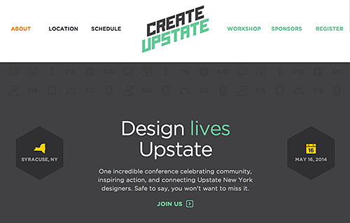
I've been a working designer in Upstate NY for the past 20 years. Last Friday was a first--an upstate-wide conference celebrating and connecting our design community. The official Create Upstate site is here, and there's a great review of the day by type designer Tyler Finck, here. I certainly hope this event is the first annual, it was a fabulous day for everyone involved.
Link
06 May 20:27
(If you can not see a video above view this post on Quipsologies)


Vol. 88 | No. 82
by arminvit
Great mini documentary on the sign painters of Dublin.
Link
(If you can not see a video above view this post on Quipsologies)
Suzymarie.johnson likes this
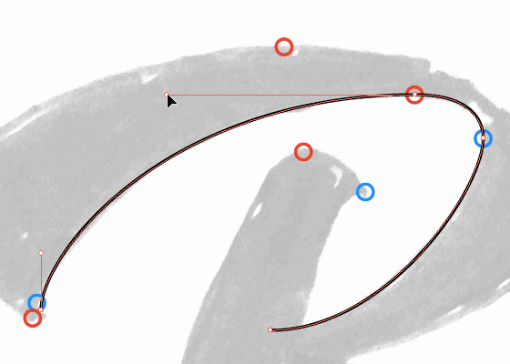
06 May 19:47

Vol. 88 | No. 89
by arminvit
A great, illustrated read on the importance of keeping your bezier's curve handles perfectly vertical and horizontal.
Link
Suzymarie.johnson likes this
06 May 19:40
(If you can not see a video above view this post on Quipsologies)

Vol. 88 | No. 95
by arminvit
Lovely mini-doc by Daylight on the great hand-drawn lettering and illustration of London-based Daren Newman.
Link
(If you can not see a video above view this post on Quipsologies)
06 May 18:40

10 Super Useful jQuery Plugins for Better Typography
by Henry Jones
No one ever said that web typography is easy, but it has gotten easier in recent years with the wide spread adoption of web fonts, the introduction of helpful typography tools, and as we see in this post, super useful jQuery plugins.
For this post, we’ve gathered 10 jQuery plugins that will help do things like create fluid text, responsive headlines, cool text animations, and a lot more.
Squishy
Squishy is a jQuery plugin that automatically resizes text to exactly fit the container with no extra work on your part.

slabText
A jQuery plugin for creating big, bold and responsive headlines.

Textillate
A simple plugin for CSS3 text animations.

FlowType.JS
Web typography at its finest: font-size and line-height based on element width.

Hatchshow
A jQuery typesetting plugin for balancing measures.

Bacon
Bacon is a jQuery plugin that allows you to wrap text around a bezier curve or a line.

CircleType.js
Circletype.js is a tiny (2.7kb) jQuery plugin that lets you set type on a circle.

jQSlickWrap
jQSlickWrap is a plugin for jQuery which enables you to easily and accurately wrap your text around the content of floated images.

TypeButter
TypeButter allows you to set optical kerning for any font on your website. If you’re longing for beautifully laid out text that today’s browsers just don’t provide, this is the plugin for you!

Responsive Text
A jQuery plugin to set font sizes responsively based on its’ container width. Use jQuery responsiveText to have scalable headlines, build responsive tables and more!

Suzymarie.johnson likes this
22 Mar 14:22

11 Inspiring Single Page Websites
by Gisele Muller
Single page websites are an excellent way to deliver a clean and simple experience. Showcasing everything you need in a single page may be a challenging process, but a lot of designers love this idea and put together amazing one page designs. From a simple page with pics and text, to amazing parallax scrolling effects, there are several different approaches to creating a single page site. Not every project is suitable for this approach, but if yours allow you to take this route, go for it.
Mixio

VTcreative

Yellow Conference

Black Creative

CampaignLabs

Heikopaiko

Darren Wilson

PageLanes

The Kyoto Protocol Petition

Drawtoclick

Gabe Abadilla

Milenkas likes this
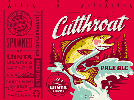
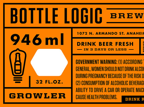
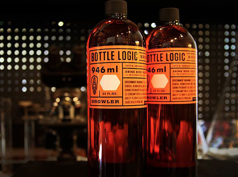
22 Mar 14:06


Josh Emrich
by Dave
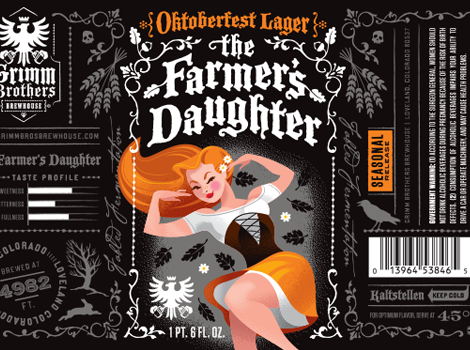
Josh Emrich is an illustrator and designer based out of Colorado. A former principal at Tenfold, in 2013 he broke off to form his own studio focused on branding and packaging design for craft brewers and artisanal entrepreneurs. His portfolio is filled with outstanding work, but i’m especially fond of his packaging design for Grimm Brothers Brewhouse. Through a series of labels he seamlessly merges slick illustrations, compelling typography and strong visual storytelling. Think Mary Blair with a twist of German macabre.


——————–
Also worth viewing:
Ross Gunter
Philographics
Lufthansa + Graphic Design
Not signed up for the Grain Edit RSS Feed yet? Give it a try. Its free and yummy.
——————–
22 Mar 13:56
(If you can not see a video above view this post on Quipsologies)


Vol. 87 | No. 50
by arminvit
Prototypo, a new WYSIWYG font-designing software by Byte Foundry. Intriguing.
Link
(If you can not see a video above view this post on Quipsologies)
22 Mar 13:17

Vol. 87 | No. 70
by arminvit
"4CP | Four Color Process", a blog dedicated to the wonderful halftone screen textures found in tiny areas of vintage comic books.
Link
Suzymarie.johnson likes this
27 Dec 16:38

Best jQuery Plugins of 2013
by Gisele Muller
So far in our “Best of 2013″ series, we’ve looked at free fonts and free PSDs. And now it’s time to highlight what we feel like are the best jQuery plugins of this year. There are always lots of jQuery plugins being released, but we think that these standout from the rest in what they can offer from a functionality standpoint.
jQuery Scroll Path
jQuery Scroll Path it’s a plugin for defining custom scroll paths. It uses canvas flavored syntax to draw lines and arcs.

freetile.js
Freetile is a plugin for jQuery that enables the organization of webpage content in an efficient, dynamic and responsive layout.

gridster.js
This is it, the mythical drag-and-drop multi-column grid has arrived. Gridster is a jQuery plugin that allows building intuitive draggable layouts from elements spanning multiple columns.

Fancy Input
CSS3 text typing effects for input fields.

Superscrollorama
The jQuery plugin for supercool scroll animation.

jQuery File Upload
File Upload widget with multiple file selection, drag&drop support, progress bars and preview images for jQuery. Supports cross-domain, chunked and resumable file uploads and client-side image resizing.

jQuery Validation Engine
jQuery validation engine is a Javascript plugin aimed at the validation of form fields in the browser (IE 6-8, Chrome, Firefox, Safari, Opera 10). The plugin provides visually appealing prompts that grab user attention on the subject matter.
Validations range from email, phone, and URL, to more complex calls such as ajax processing or custom javascript functions. Bundled with many locales, the error prompts can be translated into the language of your choice.

kerning.js
Take control of your web typography.


equalize.js
The jQuery plugin for equalizing the height or width of elements.

MeanMenu
A free jQuery Responsive Menu plugin for you to Hide or show menu children, Target navigation element to swap out with MeanMenu, Control screen width at which MeanMenu activates and much more.

Toolbar.Js
Toolbar allows you to quickly create tooltip style toolbars for use in web applications and websites. The toolbar is easily customizable using the twitter bootstrap icons and provides flexibility around the toolbars display and number of icons.

Smart Menus
Website menus that work on all devices.

NProgress
A nanoscopic progress bar. Featuring realistic trickle animations to convince your users that something is happening!

FlowType
Web typography at its finest: font-size and line-height based on element width.

Device.js
Device.js makes it easy to write conditional CSS and/or JavaScript based on device operating system (iOS, Android, Blackberry, Windows), orientation (Portrait vs. Landscape), and type (Tablet vs. Mobile).

Milenkas likes this
09 Dec 18:47

11 Great Examples of Video Backgrounds in Web Design
by Gisele Muller
Video backgrounds were certainly very popular during 2013. And since this trend is still staying strong among designers, we decided to gather a few examples of websites using this approach to grab the attention of their visitors. The key with video backgrounds is to properly optimize so you speed up load times without sacrificing quality.
Coulee Creative

Risk Everything

Exponent PR

L’attrape reve

Waaac

Spry

Poolhouse

Positive Advertising

Whiteroom

BKWLD

Whiteboard

21 Nov 18:33
(If you can not see a video above view this post on Quipsologies)


Vol. 83 | No. 65
by arminvit
So you know: How to carve letters on signs.
Link
(If you can not see a video above view this post on Quipsologies)
jeffgetsrss likes this
19 Nov 15:37

7 Best Practices of Responsive Web Design
by Stephan Jukic
CawamplerFor: Chris
Considering the rate at which the mobile web is growing, it’s becoming crucial that your website be ready to accept visitors who are coming in from a widely assorted array of different devices and screen sizes.
This is where responsive design can come into the picture and save your day nicely. However, with responsive design, as with anything in website design, you need to make sure that you follow along with some crucial best practices if you want your responsive site to actually work well and provide the flexibility it’s supposed to.
Mobile Users Deserve the Same Quality of Browsing Experience

One of the first and foremost principles to keep in mind when creating a responsive design site is making sure that the site is built so that the browsing experience is evenly the same for all users across the board.
This means that your site’s appearance and visual structure should change without ever creating content and function losses for users of any specific device or screen size. A visitor accessing your pages from their desktop should be getting the same sort of browsing experience as a visitor coming in through their smart phone or their tablet.
This means flexible everything and requires that you ensure all of your image, content and grids are fully fluid and will reconfigure accordingly on a wide assortment of screen sizes, such as these, which are only a small sampling of the very most popular screen sizes you’re likely to deal with.
The result should be a site that converts as nicely as this example does.

Design your Site with Responsive in Mind
When you’re wire framing your site layout together for coding into a real design, understand that there are layouts which are ideal for responsive design and those which are not, meaning there are designs that convert to assorted new sizes better than others thanks to their layout.
This means designing as simple a site layout and HTML code as possible and using simple mechanisms for core elements such as navigation and menu options, using HTML5 guidelines and doctype, and a simple overall core layout.
What you should avoid completely are things such as overly complex divs, useless absolute positioning, and fancy Javascript or Flash elements that will just complicate site adjustment on the whole.
Pay Attention to your Breakpoints
Resolutions can be defined in an assortment of breakpoints, but there are several major sizes that you need to focus on more than any others. These being:
<480px (which applies to older, smaller smartphone screen sizes)
<768px, which is ideal for larger smartphones and smaller tablets
>768px, which applies for everything bigger such as large tablet screens and desktops screens.
Also, these can be used too if you’ve got the energy and time:
<320px, which is great for older small, low res phones
>1024px stylesheet for wide screens on desktops.
These are the key breakpoints to focus on and especially the first three as well as the full desktop resolution, which is greater than 1024px.
Make your Images Flexible and Workable
With a simple design, you can make your images flexible as well to a certain degree. The easiest way to accomplish this is by simply using adaptative sizing and resizing their width.
You can do this in a variety of ways, but one of the easiest methods through which to achieve it is with this handy little tool: Adaptive Images. Bear in mind that sizing accordingly for mobile users is probably your best bet on a responsive design site if you want decent load speeds, which are absolutely crucial.

You could also use variable breakpoints and store multiple image sizes in your data for different screen resolutions, but this might become a problem in terms of bandwidth usage, and you cannot create your site with the safe assumption that all of your viewers will have access to powerful bandwidth.
Allow Compression of Site Elements and Content
Use a program such as GZIP to compress your page resources for easier transmission across networks. You’ll have lowered the number of bytes sent per page or element and made your content easier to browse and access from devices with varying or low bandwidth.
Furthermore, you can speed things up even further by removing any unnecessary white space and line breaks. Doing this will reduce file sizes overall and keep things flowing more smoothly.
Get Rid of Non-Essential Content
In order to make your mobile friendly responsive design site really shine in a very easy to achieve way, simply bear one thing in mind: Some content and content elements were never meant to be used in a mobile context and would never work there.
 Image by
 If you have these elements at play in your website or potential site layout, then get rid of them immediately for any mobile setting. You can do this by adding a .not_mobile class to specific elements that you’d like to see removed when your site is viewed in a mobile context or you can simply get rid of such elements permanently from all versions of your site.
Remember the Bottom Line
The above are just some of the major best practices you can try out, some of the more important ones.
Ultimately however, if you want your responsive design site to work well, you need to build it so that it can load and function quickly on devices that will often have low resolution, small processing power and sometimes weak bandwidth access. This means a simple, well organized site that conforms to its core function with maximal focus.
Jennifer.earl, Stjepan likes this
05 Nov 18:10
(If you can not see a video above view this post on Quipsologies)

Vol. 83 | No. 12
by arminvit
CawamplerFor: Chris, Suze
How to do roundhand lettering freehand like a boss.
Link
(If you can not see a video above view this post on Quipsologies)
31 Oct 14:47

Graphic Design: Jaime Zuverza makes the coolest posters. Ever.
by Liv Siddall

I like a man who can stick two fingers up to the InDesign grid and whip up a photo of the Pope in sunglasses faster than you can say “spliff.” Jaime Zuverza is that man, and in between playing bass guitar for Bill Callahan, he spends his time creating some of the best posters I’ve ever laid my eyes upon. Drawing inspiration from the gross, the rebellious, the toothy and the gnarled, his no-holes-barred approach to making posters is so up my street it’s basically my house. Jaime very kindly agreed to answer some questions about his work. Onwards! Let him inspire the shit out you…
29 Oct 17:42

Read More »


Kanpai! The Five Best 12 Year Old Japanese Whiskies
Last week hummus and yoga were “in”, and while they’re not out yet, there’s a new top dog in Popularville: Japanese Whisky. Notice the spelling -- that’s whisky with a -y, like Scotch whisky, not whiskey with an -ey, the spelling used for U.S. and Irish varietals. Yes, the Japanese whisky industry was modeled after the Scottish single malt industry's practice of distilling and blending under one roof, but it's since taken on a life of its own. As a result of several recent victories over Scottish whiskies at blind tasting competitions, Japan’s best-kept secret escaped, and the world is eager to test the hype. We tasted five of the best 12-year-old Japanese whisky offerings, and we can assure you that the hype is warranted.
...Read More »
18 Oct 14:34

10 Super Useful Tools for Better Web Typography
by Henry Jones
CawamplerFor Chris/Suzy
It’s been said that web design is 95% typography. So as a web designer, getting the typography right is a must. Today with the growing popularity of web fonts and modern CSS techniques, this task has become easier, but it never hurts to have all the help you can get with something so critical. That’s why we’ve rounded up some useful tools to help you create better web typography.
Typewolf
Typewolf is a curated design showcase that identifies the fonts used in the design. Our goal is to serve as a one-stop resource for designers seeking typographic inspiration for the modern web.

Tiff
A type diff tool that visually contrasts the differences between two fonts.

TypeWonder
TypeWonder helps you to test web fonts on any website on the fly!

FFFFALLBACK
Web fonts are here, sparking an exciting new era in web design. FFFFALLBACK makes it easy to find the perfect fallback fonts, so that your designs degrade gracefully.

Fontdeck
Fontdeck is standards compliant, accessible and uses a pure CSS @font-face solution. No JavaScript required.

Typecast
Use Typecast to create visual and semantic designs. Check for readability, rendering and beauty then share a working prototype of your design.

FontFriend
FontFriend is a bookmarklet for typographically obsessed web designers. It enables rapid checking of fonts and font styles directly in the browser without editing code and refreshing pages, making it the ideal companion for creating CSS font stacks.

Typekit
The easiest way to use real fonts on your website.

WhatFont
WhatFont also detects services used for serving the font. Now supports Typekit and Google Font API.

Font Combinator
This tool has been built to allow previewing of font combinations in a fast, browser-based manner. There have been numerous printed books through the years that allowed a designer to put a headline font next to a body font, and this is an attempt to recreate that for the web.

07 Oct 14:50


Vol. 82 | No. 21
by arminvit
CawamplerFor Chris
Ever wonder what would be inside the "junk drawer" of pop-culture characters? Matt Stevens does. A three-part print series that includes drawers from Walter White, Batman, and (shown) Pee-wee Herman.
Link

04 Oct 13:25

Read More »


Running on Juice
CawamplerFor Lukey
This summer, curious about the benefits of an 80% raw fruit diet, we joined a gathering of Fruitarians in upstate New York at the Woodstock Fruit Festival. While we didn't convert to Fruitarianism (unless the ritual strawberry dance was an initiation), we did meet Chris Kendall, a holistic nutritionist, raw vegan athlete and all-around fruit guru, and tapped him for an easy juice recipe ideal for runners.
...Read More »
Jedsouter likes this
05 Sep 19:32
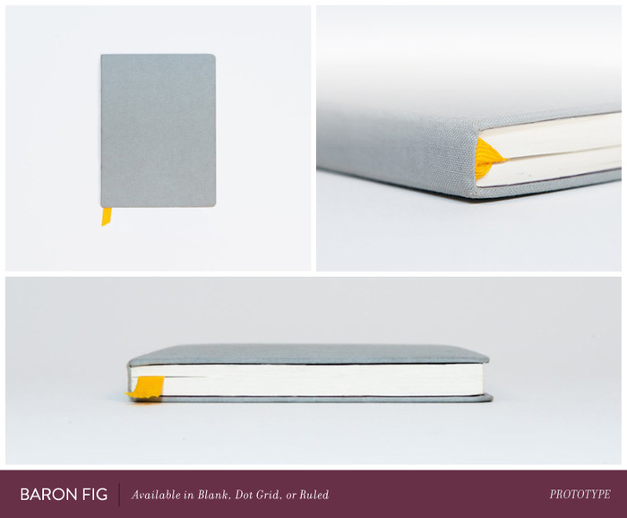

Vol. 81 | No. 11
by quipsologies
Moleskine, step aside. Baron Fig will be the new sketchbook in town designed with an underlying philosophy of simplicity, usefulness and community. Currently on Kickstarter.
Link
24 Aug 13:02

Publication: Tim Leong's infographic study of the comic book world
by Rob Alderson

There’s been a lot of talk lately about misuse of the appellation “geek,” now applied and claimed far too liberally by anyone trying to make themselves more interesting. It’s refreshing then to be reminded what true, grade A, 24-carat geekery looks like thanks to Wired digital design director Tim Leong and his new book Super Graphic. Best summed up by its subtitle “A Visual Guide To the Comic Book universe” this is a brilliant collection of infographics communicating everything from “The Joker’s Favourite Questions for Batman” to “The Chris Ware Sadness Scale” and a comprehensive comparative study of the different Marvel characters’ attributes.
24 Aug 12:54
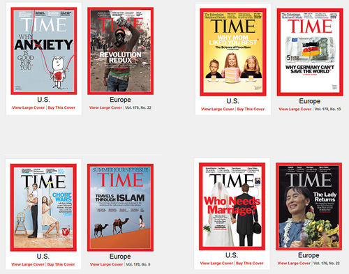


Vol. 80 | No. 79
by arminvit
A few examples of the drastic differences in the covers that TIME magazine produces for the U.S. market and those for Europe, Asia, and the South Pacific. Seems we can't handle straight-up news.
Link