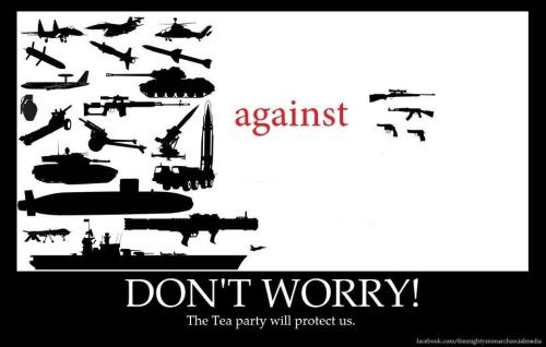
Yup - mostly. I have no heartburn with my hunter buddies owning guns that they think look cool - the appearance of this gun doesn't bother me. But in practice, there's no need for the high fire rates and high capacity clips for any peaceful purpose.
This gun is legal to own.
You know, for hunting or personal safety or any other Second Amendment reasons you might have or for no reason at all but just because America and guns go hand in hand.
I cannot fathom why someone would do the sort of thing that someone did today. And I cannot fathom why the rest of us think it’s acceptable to let anyone get their hands on weapons like these with such ease.
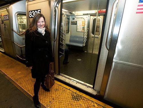
For the second time in a week, a man falls onto the New York subway tracks in front of an oncoming train.
The first time, of course, was very heavily publicized … in no small part because the man was pushed, because he wasn’t helped by onlookers, and because he was killed by the train.
This time, however, another man jumped down onto the tracks to help and then was himself assisted by several other onlookers:
[Victor] Samuel, a Queens father of two, was yanked to safety from the tracks of the Bowling Green station after risking his life to save a dazed drifter from an oncoming No. 5 train.
Now he hopes to get together aboveground with Doreen Winkler, the diminutive Brooklynite whose efforts spared Samuel and the second man from dying beneath the subway wheels.
Samuel, speaking Saturday to the Daily News, said the two could ideally meet for coffee in a less “stressful” situation to discuss their lifesaving efforts. He’s already contacted her through the Internet.
And he sent along thanks to the others on the platform who pulled him and Jack Simmons, 64, from the tracks.
The rescue was “a collective effort,” he said. “I really want to give credit to a lot people for helping out.”
The 43-year-old good Samaritan doesn’t regret his decision to make the Thursday night leap — even as thoughts of Monday’s subway death of Ki-Suck Han flashed through his mind.
“I had to make a very split-second decision … literally just a split-second decision to go in there,” he said of jumping down on the tracks. “I’d really rather not be in the spotlight for it.”
[…]
The 5-foot-2 Winkler, who moved to Brooklyn four years ago from Germany, was among the frantic crowd on the platform.
She described grabbing both men by their arms and yanking with an adrenaline rush as two other woman assisted the rescue on the northbound platform.
There hasn’t been nearly as much discussion of this successful rescue effort and, given my post yesterday about people standing by rather than helping, I thought it was important to see if we might get some insight into how people can — and often do — come to the assistance of others:
The 5-foot-2 Brooklynite wept Friday when recounting her adrenalized effort as visions of this week’s fatal subway shove ran through her head.
“I had one arm each of each man,” she told the Daily News. “I was freaking out that nobody was helping at first.”
Her heroics elicited applause from fellow straphangers — mere seconds after the lower Manhattan subway station echoed with screams and gasps of horror.
“You can’t ever, ever, ever watch somebody die,” said Winkler, who moved to New York four years ago from Hamburg, Germany.
Winkler said she couldn’t shake the image of Ki-Suck Han, 58, pushed into the path of an oncoming train Monday afternoon in midtown. The Korean immigrant was killed before anyone could come to his aid.
“Not again,” she said. “The whole time in my head, not again. I kept thinking I’m going to watch him die.”
This story has me wondering a couple of things:
1. How much Winkler’s personal history, as a German who recently moved to New York, factored into her feeling that it was necessary to assist someone in need and how much she was influenced by the image of Ki-Suck Han’s death earlier in the week.
2. Relatedly, whether it matters more that almost no one is paying attention to this story where people helped or that everyone paid so much attention to the story about no one helping. In other words, are we more likely to encourage helping behavior by highlighting stories where people act heroically or where they fail to do so?
I don’t yet know my answer and I can see a plausible argument for both sides of this question. I’ll be thinking about it all week and we’ll discuss it on the Hero Report podcast on Friday afternoon at 4pm Eastern (which you’ll be able to watch and on which you can comment live, either here on my blog or on Google+). In the meantime, I hope you’ll send me your thoughts … either with Tumblr’s Ask feature, via the blog’s Facebook page, using the Disqus comment feature at the bottom of this post, in 140 characters on Twitter, or via email.
The strongest arguments for orphaned works legislation come from organizations that want to digitize libraries, researcher institutions, and scholars. These are people like the biographer who finds a shoebox full of old, unattributed photos of her subject but can’t identify or locate the photographer. Without the ability to contact the photographer the biographer can’t know the copyright status and therefore can’t publish the photos without exposing herself to significant liability—up to $150,000 per use. The result: it’s not published, the original creator never has the opportunity to profit from the biographer’s interest, and the world is a poorer place because interesting work remains in the shoebox under the bed essentially undiscovered. The inability to locate copyright holders prevents museums from using material in exhibits, documentary filmmakers from including historic recordings, scholars from publishing archives of historic work—and nobody including the original creators of the work benefits.
These arguments have one basic thing in common—they are concerned with older works, works that under previous copyright regimes would have passed into the public domain. The problem that orphaned works legislation is trying fix is a problem that in large part has been caused by the continual extension of copyright protection to the point that even work from the distant past is encumbered with liability and few options to limit it.
Crafting a solution that addresses old, mostly-forgotten works without jeopardizing the livelihood of active creatives has proven elusive. The proposed legislation effectively removes the powerful liability that puts teeth into copyright laws so long as users can assert in good faith that they tried and failed to locate the author. This is especially problematic for photographers because the tools for working backward from an image to its creator are still immature. Google images only gets you so far.
The truly disheartening part of this story is that there is no reason for work created today and distributed digitally to ever become orphaned in the first place. These aren’t prints in a shoebox under a bed; they are digital files that can easily carry metadata including the author’s contact information with them everywhere they go.
The Promise of Metadata
There is not a single file format in standard use that does not make provisions for tagging the work with information about the author, photographer, composer, artist, or publisher. Jpegs, the standard file format for photographs on the web, are easily tagged with the photographer's name, contact information, release and copyright status, as well as full host of caption and location data. This information rides along with the image, it is generally invisible to the viewer, but it is available to anyone who needs it through all standard software. Because the image and the metadata stick together in one convenient package we should, in theory, no longer worry about our work becoming separated from us and falling into the creative orphanage where this legislation may remove significant copyright protections.
Even Apple's Preview App will display image metadata
But here’s the rub: It is standard practice to strip this metadata from images. Upload an image to Facebook and Facebook wipes all contact and copyright information clean. Twitter does the same thing. This becomes very frustrating when you have an image that catches on, gets passed around in ways that you as a copyright holder may not mind, but ends up on servers all over the world with no metadata pointing back to you. These services that provide some of the most-used tools for sharing content are creating millions of potentially orphaned works every day. And there is no reason for it—the tools to preserve metadata are ubiquitous and easy to use.
A Case Study
Here’s an example from someone who should know better, National Geographic. They recently finished their annual photography contest, one of the most popular contests in world that attracts professional and amateur photographers from around the world with the promise not only of prizes, but serious exposure for photos that the editors choose to highlight. But when they publish the images, the metadata is stripped. This in itself doesn’t orphan the images—they provide a caption that includes the photographers name (although not contact information). But unlike metadata within a file, a caption adjacent to an image does not travel with it.
So the work begins to get picked up and spread around:
In the course of a couple days this image went from an annotated jpeg with my complete contact information to a bunch of unattributed files scattered all over the world with no metadata whatsoever. In National Geographic's defense, this is probably unintentional. Many of the basic tools that automatically process images on web servers strip metadata by default. If you're not paying attention you can lose this information by simply resizing a photo.
Google Image Search after a couple days—all without any metadata pointing back to the photographer.
This shouldn’t happen.
If we are going to have orphaned works legislation that removes liability for using copyrighted work when the author cannot be found, we should include language that compels organizations that traffic in content like Facebook and Twitter to keep metadata intact. Give it some teeth and allow copyright owners to go after organizations that strip authorship information from their work. We should also encourage developers who write the tools for manipulating content to make preserving metadata the default. It should require an active, intentional act to strip metadata from digital files. We should also encourage developers of viewing software like web browsers to make it easier to access this metadata. Wouldn’t it be nice it you could hover over an image in your web browser and get a tool-tip with the photographer's name and website? And, of course, we as photographers need to understand the tools and remember to save metadata with files destined for the web. It won't fix all the problems with the legislation, but it is a sensible and important step to prevent new work from becoming orphans for no reason. If you have other ideas, please consider [submitting a comment]((http://www.copyright.gov/orphan/comment-submission/) to the copyright office before February.
Thanks to Scott and Brad for the opportunity to be guest blogger. Once given the platform to blog, my issue became what I should blog about because I wear many hats. I am co-founder of D65 and we conduct Lightroom workflow workshops around the US and have a new book on Lightroom 4 called D’65’s Lightroom Workbook, Workflow, Not Workslow in Lightroom 4. Additionally, I am a partner in Digital Photo Destinations with John Paul Caponigro and we conduct workshops in exotic locations like Antarctica, Iceland, Chile and any location presenting amazing photo opportunities. Of course I am a photographer as well and could easily write about being a cryophiliac “love of Ice.” My passion is color but my muse is ice, hence “cryophiliac”.
After contemplating all the possibilities I decided to blog about one of my anal habits. KEYWORDING and for continuity decided to write about Keywording in Lightroom.
KEYWORDING IN THE LIBRARY MODULE I have been called the King of Keywording. The best way of using any DAM (Data Asset Management) software is to take advantage of the application’s ability to find specific images. Proper keywording is not only advantageous, but essentially the only way of finding specific images in a very large collection. It is one thing to scroll through a few hundred images to find the one you want. It is an entirely different matter to scroll through 50,000 images to find the image you want. With proper keywording one can find any image in a click.
THE KEYWORD LIST PANEL A keyword tag or “keyword” is metadata that categorizes and describes the key elements of a photo. According to one study, it may take more than 400 keywords to accurately describe an image without actually looking at the thumbnail. Building a Keyword Hierarchy can be a tedious and painful task, but it is essential to digital asset management.
Keywords help in identifying and searching for images in a catalog. Keyword tags are stored either in the image files or in XMP sidecar files or in Lightroom Catalog. The XMP can be read by any application that supports XMP metadata.
Keywording Images To keyword your images, think globally first and then go for local. Think of keywording the same way you would classify an animal. A Spider Monkey would first be a Mammal then an Ape, then a monkey and finally a spider monkey. For example, to classify Palm Beach Gardens (where I live), you would……start with a parent called Continent and a child called North America. A second Parent Inside North America would be called Countries, with a child keyword of United States. A third Parent might be called States, with a child keyword of Florida and finally a parent called Cities with a child called Palm Beach Gardens. You could even add sub categories like South Florida . So the hierarchy might look like this: North America > United States > Florida > South Florida > West Palm Beach> Palm Beach Gardens. So it might take 6 keywords just to classify Palm Beach Gardens. Most images that I prepare have about 50 keywords which really isn’t all that much when you consider the concept of hierarchies.
Below is an example of an image of a green iceberg from Antarctica, with proper keywording. The top level Parent Keywords are in CAPS but they are private metadata and act as a placeholder and do not export with the image. All the child levels have the first letter of each word capitalized.
Location is an obvious keyword but there are many keywords that aren’t as obvious that make finding and organizing images a breeze. I have a Parent called Technique…
…whose Children include items like Blur, Reflections, Macro, Motion, Silhouette, and Time Exposure. This really helps when looking for certain types of images.
I have another Parent called View…
…with Children like Aerial, Eye Contact, Fisheye, Panorama, and Underwater. Again, the more specific the keyword, list the easier it becomes to find images that you seek.
Creating and Managing Keywords Keywords can be generated by clicking on the + sign to the left of Keyword List. Keywords can be removed by highlighting the keyword and clicking on the – sign to the left of Keyword List. Keywords can also be created by typing in a keyword in the “Click here to add keywords” box under Enter Keywords in the Keywording Panel.
Parents and Children in Keyword List The top level parents are in capitals and are private, meaning that they do not export. They are placeholders only. The first letter of each child is capitalized. The number of images that contain a given keyword are displayed to the right of the keyword. By clicking on the number adjacent to any keyword tag, you will go to those images that contain that keyword.
Creating Keyword Tags with Synonyms and Export Options When creating keywords, you can add synonyms and export options. Synonyms are similar or related terms for keyword tags. Synonyms allow you to apply one keyword and automatically apply additional synonyms. For those of you keywording animals, for example, one very useful tidbit is to use the Latin name or scientific name of the animal as a synonym.
Creating Private Metadata You can also choose to include keywords or exclude keywords on export. This too is a very valuable feature. I use keywords for jobs, portfolio images, stock agencies and for names of folks I know. I even have a keyword for Scott Kelby. I put this type of information into a Parent Keyword called Private Metadata and exclude it on export. This way the information becomes useful in searching within Lightroom but it isn’t included in the images on export.
Keyword tags can be created as children of parent keyword tags. For example, a parent tag might be “Weather” and the child could be “Hurricane” and you could apply a group of synonyms at the same time.
The Keyword Filter The Keyword Filter is a very useful tool. In my Keyword List, I have over 6,000 keywords all listed in a hierarchy. One of the problems of working with keywords in a hierarchy is locating a particular keyword. The Keyword Filter makes this easy. Simply type in the keyword you are looking for in the filter and it locates it for you in the hierarchy. In the image below I searched for the keyword “Leopard” and the filter traced it to the parent Animals and the full hierarchy leading to Leopard. It also conveniently displays the number of images with this keyword.
Keywording also utilizes autofill. The application tries to fill in the remainder of a word before you finish typing. While most folks find this useful, if you want to turn this off, open Catalog Settings — Metadata tab then deactivate “Offer suggestions from recently entered values.”
Keywording Tips
$#x2022; If an asterisk appears next to a keyword that means that this keyword is present in some but not in all of the selected images:
$#x2022; In the Grid mode, you can see that an image has keywords with the keyword badge. Clicking on this badge will bring you to the Keywords panel and display the keywords in the image:
$#x2022; Clicking on the number of keywords for a keyword will bring up all of those images in the Grid. Below, I clicked on the number 311 next to Neon Light and all 311 related images appear in the Grid. It is an awesome way to cull images and create collections of specific types of images. Every time you add a keyword to an image, the Keywords Tags panel will keep track of how many images in your entire Library have that specific keyword.
Keyword Sets Keyword tags can also be organized into categories called keyword sets. I might create a keyword set for “Lightning,” for example, which includes words like Electrical Storm, Lightning, Thunder, Thunderstorm, Ominous, and Downpour. Every time lightning is photographed, you could choose this set and apply each keyword. Unfortunately you can’t apply the entire set with one click.
To create a Keyword Set, go to the Keyword Set Panel and click on drop-down menu, choosing “Save current settings as a new preset.”
Organizing Keywords in Workflow Keywording, while very powerful, can quickly get out of hand if the keywords aren’t organized. In order to keep your keywords organized, I suggest creating keywords in the Keywording Tags panel and to regularly arrange Parents and Children in the Keyword List. Do not wait until you have several hundred keywords to begin the organization. My advice is to organize on a regular basis.
Creating and Applying Keywords You can create and apply keywords in various ways in the Library Module. I will demonstrate them all below.
1. Keywording Panel: The Keywording Panel is located on the right-hand side of the Library Module. To use it, select one or more images in the Grid and start typing the keyword(s) you want to insert in the keyword tags panel. Hit Return and the keywords will be placed in the image(s). Note: To create parent-child relationship hierarchies, use the pipe key (|) between the keywords or drag keywords from the keyword list into other keywords.
Enter Keywords
2. Copy and Paste Keywords: Select one image, keyword it, and then copy and paste the keywords from one image to another.
3. Sync Keywords: Select one image, keyword it, then select the other images you want to contain those keywords and choose Sync Metadata. Scroll down and place a checkmark in Keywords.
4. Drag Keywords: Select one image or a group of images and either drag the image(s) to the keyword, or drag the keyword to the image(s).
5. Painter Tool: Click on the Painter Tool in the Toolbar and add keywords to the field in the Toolbar. After the keyword(s) are added, hit Return to save them. The Painter Tool can then be used to apply these keywords to other images.
Click on the image(s) that you want keyworded with the Painter Tool. Once you click on the image(s) you will see the assigned keywords on your screen and that the keywords have been applied.
Painter Tool Workflow Tips:
$#x2022; Using the Option key will turn the Painter Tool into an Eraser Tool—in Lightroom 3 the Painter automatically became an eraser after applying the Painter—the use of the Option key to toggle the Painter Tool to an Eraser Tool is a welcome change.
$#x2022; Remember to click off the Painter Tool when you are done with it, or you will continue to “paint” all your images
$#x2022; If the Painter Tool has a keyword associated with it, the shortcut Shift-K will apply the keyword—this is totally cool because you can be in full screen view and use the shortcut Shift-K to apply keywords
6. Check Box in the Keyword List Panel: Select one image or a group of images and click on the check box next to the keyword you want to apply.
7. Keyword Suggestions and Keyword Set: One feature that is truly fantastic is Keyword Suggestions in the Keywording panel. The concept is that if you apply a keyword to a specific image, that keyword will become a suggested keyword for any other images that share a close enough capture time. This feature is great most of the time and should allow a faster way to generate and apply keywords, but just because the capture times are similar does not always mean that the images are similar. To apply both keywords from the Keyword Set and/or from the Keyword Suggestions, simply select your image(s) and click on the keyword(s) in the set or in the suggestions.
Below is a folder of images called 20110123_vumbura_plains. As I browse this folder, I see that there are images with lions and I decide I want to see how many other images in the entire catalog have lions.
Since all of our images are keyworded, I go to the keyword list and click on the number 208 next to the keyword “Lion.”
After I click on the number 208 next to “Lion,” I am now in the entire Catalog showing all the images that contain the keyword “Lion.” I might consider making a collection of Lion or I might want to go back to my Vumbura Plains images. Most folks end up navigating through the hierarchy of folders and this can be tedious and time consuming.
Instead, clicking on the “Go Back” button in the Filmstrip, I can return to my original Vumbura Plains folder. While I only went back once in this demonstration, the Go Back and Go Forward Buttons allow you to go back or forward to ten, twenty or even a hundred locations if you so desire.
Keywording may not be the slickest thing in Lightroom but it sure is useful and it certainly is a critical part of a good Digital Asset Management System. If you have ever spent hours clicking away in each folder looking for a particular image then you are an ideal candidate for keywording. When images are correctly keyworded you can find any image in an instant.
One last thing about keywording. Developing your own keyword list can take hundreds of hours. I know because I created a list of almost 7000 words. I would wake up at 3 AM and sit at the computer non stop until about midnight. I did drink some fine wines during this psychotic time but nonetheless it still took about a week of solid work. The good news is that my list can be licensed for your own use.
"Dominos and cards are better than anything that requires a battery....." TRUTH.
Dear Family,
I’m not dead yet. Thanksgiving is still important to me. If being in my Last Will and Testament is important to you, then you might consider being with me for my favorite holiday.
Dinner is at 2:00. Not 2:15. Not 2:05. Two. Arrive late and you get what’s leftover.
Last year, that moron Marshall fried a turkey in one of those contraptions and practically burned the deck off the house. This year, the only peanut oil used to make the meal will be from the secret scoop of peanut butter I add to the carrot soup.
Jonathan, your last new wife was an idiot. You don’t arrive at someone’s house on Thanksgiving needing to use the oven and the stove. Honest to God I thought you might have learned after two wives – date them longer and save us all the agony of another divorce.
Now, the house rules are slightly different this year because I have decided that 47% of you don’t know how to take care of nice things. Paper plates and red Solo cups might be bad for the environment, but I’ll be gone soon and that will be your problem to deal with.
House Rules:
The University of Texas no longer plays Texas A&M. The television stays off during the meal.
The” no cans for kids” rule still exists. We are using 2 liter bottles because your children still open a third can before finishing the first two. Parents can fill a child’s cup when it is empty. All of the cups have names on them and I’ll be paying close attention to refills.
Cloe, last year we were at Trudy’s house and I looked the other way when your Jell-O salad showed up. This year, if Jell-O salad comes in the front door it will go right back out the back door with the garbage. Save yourself some time honey. You’ve never been a good cook and you shouldn’t bring something that wiggles more than you. Buy something from the HEB bakery.
Grandmothers give grandchildren cookies and candy. That is a fact of life. Your children can eat healthy at your home. At my home, they can eat whatever they like as long as they finish it.
I cook with bacon and bacon grease. That’s nothing new. Your being a vegetarian doesn’t change the fact that stuffing without bacon is like egg salad without eggs. Even the green bean casserole has a little bacon grease in it. That’s why it tastes so good. Not eating bacon is just not natural. And as far as being healthy… look at me. I’ve outlived almost everyone I know.
Salad at Thanksgiving is a waste of space.
I do not like cell phones. Leave them in the car.
I do not like video cameras. There will be 32 people here. I am sure you can capture lots of memories without the camera pointed at me.
Being a mother means you have to actually pay attention to the kids. I have nice things and I don’t put them away just because company is coming over. Mary, watch your kids and I’ll watch my things.
Rhonda, a cat that requires a shot twice a day is a cat that has lived too many lives. I think staying home to care for the cat is your way of letting me know that I have lived too many lives too. I can live with that. Can you?
Words mean things. I say what I mean. Let me repeat: You don’t need to bring anything means you don’t need to bring anything. And if I did tell you to bring something, bring it in the quantity I said. Really. This doesn’t have to be difficult.
Dominos and cards are better than anything that requires a battery or an on/off switch. That was true when you were kids and it’s true now that you have kids.
Showing up for Thanksgiving guarantees presents at Christmas. Not showing up guarantees a card that may or may not be signed.
The election is over so I’ll watch what I say and you will do the same. If we all stick to that, we’ll have a good time. If not, I’ll still have a good time but it will be at your expense. In memory of your Grandfather, the back fridge will be filled with beer. Drink until it is gone. I prefer wine anyway. But one from each family needs to be the designated driver. I mean it really.
There's no denying it: Chinese is a language full of homophones. And this profusion of words that sound alike but have different meanings can be confusing. But fear not! In the previous post in this series, I offered some reassurance: Mandarin grammar is easy. In that same spirit of optimism and oversimplification, I will now explain why the daunting abundance of homophones is a price well worth paying given what it buys: a simple system of pronuncation.
My main goal is to explain Mandarin pronunciation informally, so I will avoid linguistic terminology and fine distinctions. Words such as "alveolar", "plosive", "labio-dental", and "velar" occur only in this sentence, so you're past them now. (ht2mp) My subsidiary goal is to harvest corrections, so bring 'em on!
There have been many systems for transcribing Chinese sounds into languages that use the Latin alphabet, but there's no question that the dominant, standard system today is Pinyin. Googling "pinyin chart" in your preferred search engine will yield many examples of the conventional Pinyin table, which is a 2-dimensional grid of syllables. My favorite software for associating these syllables with sounds is the downloadable Pinyin Chart from ChinesePod.com.
For pedagogical reasons, I have rearranged the Pinyin table and annotated it. Here's my cheat sheet as a PDF. And here it is as a JPG:
Pinyin Chart Rearranged
I'll refer to it a few times below.
The Good News: syllables!
Here's why learning to pronounce Mandarin is feasible rather than crippling: there is a very small number of syllables to learn, and each is always pronounced in exactly the same way.
1. Ingredients of a syllable: Every syllable in Mandarin consists of three factors: an initial sound, a final sound, and a tone.
2. Initials: There are 22 initial sounds: the null sound (i.e., the lack of an initial sound) and 21 consonants:
b, p, m, f, d, t, n, l z, c, s, zh, ch, sh, r
g, k, h, j, q, x
The boldfaced, underlined consonants pose a challenge for the native speaker of English, but later I'll explain a way to think about them that I find useful. The rest are pronounced pretty much the way you'd expect. (The "h" is breathy and wet, like the soft "ch" of "ich" in German, for example, but that's precisely the sort of nuance I'm going to ignore for the most part in this post.)
3. Finals: So every syllable either starts with no initial or with one of those 21 consonants. And every syllable continues with one of 35 vowel finals. A final is a vowel sound which may or may not end in a nasal (n or ng):
a, ai, ao (an, ang)
o, ou (ong)
e, ei (en, eng) er
u, ua, uai, uo, ui (uan, uang, un, ueng)
i, ia, iao, ie, iu (ian, iang, in, ing, iong)
ü, üe (üan, ün)
Here, too, the boldfaced or underlined items pose a challenge. But knowing that the boldfaced ones are actually contractions helps to make sense of how they're pronounced. More on this later.
In addition to those 35, there's the pirate-"er" sound. Arrrrr! (Actually, it's like "err" as in "to err is human" when "err" is pronounced like "Burr". Actually, it's somewhere in between!)
4. Do The Math: So then, we have 22 consonants (including null) and 36 finals (including 16 nasals and pirate-"er"). Think about what this means: there are only 22 x 36 = 712 possible syllables! And the great news is that not every logically possible syllable occurs in the language. For example, you won't see f+ao or r+uang or p+uo or zh+ie. They don't happen.
Of the 712 sounds in the Cartesian product, how many do actually occur in the language? Only 404. Four Hundred Four! So if you can learn the correct way to pronounce these 404 syllables, then you can utter any Mandarin there is. (By including some interjectional grunts, this guy (Google-cached here) who knows more than I do comes up with 413. Others count 407 or 409 or 412. Whatever.) By way of comparison, English has 26 letters, 5 (or 6 or 7) of them vowels, but the rules of combination allow for as many as 10,000 distinct syllables. Estimates of how many actually occur range from around 2500 to 4000+, an order of magnitude more than in Chinese. And English diphthongs are faithless, and the consonants untrue.
The Somewhat Less Good News: tones
404 syllables? A cinch! However, there's a hitch: A speaker– especially one whose language has evolved for thousands of years– cannot say everything we humans need to say if he has at his disposal only 404 syllables. The language deals with this in three ways: multi-syllable words, tonality and homophony.
5. Tones: In addition to having an optional initial and a mandatory final, each syllable in Mandarin (by which I mean the 404 that actually occur) may be pronounced in one of four tones or in a neutral way (sometimes called the "fifth tone" though it's actually a wimpy schwa-like afterthought of a tone). Each syllable may have a different meaning, or multiple meanings, in each tone. Tone changes meaning.
For example, wang1 (wāng) means "to ooze" (汪), wang2 (wáng) may mean "king" (王) or "to die" (亡), wang3 (wǎng) may mean "past" (往) or "network" (网) or "spoked rim" (辋), and wang4 (wàng) may mean "to peer into the distance" (望) or "to forget" (忘) or "presumptuous" (妄) or "flourishing" (旺).
Note that the meanings for a syllable from one tone to another may have no etymological connection. This system isn't like the consonantal triad in a semitic language, which serves as the skeleton of a root and helps to delimit the semantic reach of its words. In Mandarin, the meanings are sometimes related, as with wéi (喂, "hello" when answering the phone) and wèi (喂, "hey!" as in "Hey, you! What are you doing with that post-hole digger?"), but usually they are not.
6. Re-reckon them figgers: The neutral pronunciation occurs for very few syllables, so let's bracket that one out. That leaves four tones across 404 syllables for a grand total of 1616! But the good news here is that not every logically possible syllable+tone combination occurs in the language. In fact, only about 215 syllables occur in all four tones. By one count, which includes the neutrals, there are only 1396 syllables in all:
syllables occurring in 1st tone: 349
syllables occurring in 2nd tone: 282
syllables occurring in 3rd tone: 350
syllables occurring in 4th tone: 375
syllables occurring in neutral tone: 40
Total: 1396
Can you learn 404 words? Can you learn the 4 tones? Then you can pronounce more than all the syllables in Mandarin! (Count your blessings. Cantonese has 7 tones….)
7. You already know the tones: Yes, you do:
The first is constant and high-pitched (not absolutely, but in relation to your natural voice): "One is the loneliest number…." or "Shall we dance…."
The second is the sound we native English speakers make at the end of a question: "You want to go where?"
The third descends to a low tone (often with some croaky vocal fry) and then rises a bit, like the sound of skeptical or sarcastic astonishment ("Really?!") or coaxing (to a puppy on a tightrope: "Good… Come get the treat….").
And the fourth descends quickly and sharply: "Stop!"
These sounds (level, interrogative, coaxing/doubting, assertive) occur in the wild in English. Youtube offers many videos that explain theses sounds in detail (here are some: 1, 2, 3, 4), so I'll leave it at that.
One fact is worth emphasizing here: in everyday speech, native speakers of Mandarin tend to munge these tones in certain ways. As a result, there's often a discrepancy between what we're told a phrase should sound like and how it actually sounds when uttered. This happens because the standard descriptions of the four tones tell how they sound when a word is spoken in isolation. But words (other than, say, digits in a phone number) are seldom uttered that way.
8. Tone Sandhi: Look up "tone sandhi" for the nuances of how tones change. I'll just mention one fact of life that makes understanding the spoken language much easier: in practice, the third tone (the one that dips and then rises) hardly ever actually dips and rises; instead, it sounds like a low flat tone, a counterpart to the high first tone. If you hit that low beat (a maneuver called the "half 3rd tone") in your pronunciation during phrases, related tone sandhi will take care of themselves. Only when saying a third-tone syllable in isolation should you exaggerate the dip and rise.
What's the upshot? When learning Mandarin, it's better to exaggerate the tones than to neglect them. And it'll be a heck of a lot easier to execute the 3rd tone without sounding like a clown if you treat it as a drop to a low, flat sound in ordinary speech!
The Really Rather Distressing News: disyllables and homophones
Even with 1396 possible syllables, thanks to the 4 tones and the wimpy 5th tone, it just ain't possible to say every little thing that needs sayin', unless you make words out of multiple syllables. So most Chinese words have two syllables (and only 44% of the 1396 monosyllables can stand alone as words).
To expand the semantic horizon still further, Chinese has a high tolerance for homophones.
Classical Chinese was even more notorious in this regard, and the great, playful 20th-century Chinese-American linguist Zhào Yuánrèn demonstrated this tendency in his well-known-for-this-reason poem The Lion-Eating Poet in the Stone Den. Would it pique your interest to peek at the peak of Chinese homophony? If I raise this issue, will rays of rebuttal raze it to the ground? If I write right, like a wright, and not as a mere rite, will it instill a whit of wit? Shut up? OK, here's the poem:
In a stone den was a poet called Shi, who was a lion addict, and had resolved to eat ten lions. He often went to the market to look for lions. At ten o'clock, ten lions had just arrived at the market. At that time, Shi had just arrived at the market. He saw those ten lions, and using his trusty arrows, caused the ten lions to die. He brought the corpses of the ten lions to the stone den. The stone den was damp. He asked his servants to wipe it. After the stone den was wiped, he tried to eat those ten lions. When he ate, he realized that these ten lions were in fact ten stone lion corpses. Try to explain this matter.
And here's the gimmick of the poem: every single word in it is pronounced "shi" (which sounds vaguely like "sure") in one or another of the tones! Behold as this brave girl reads it aloud:
Are you shí you want to learn this language? Fear not. For the most part, context will clarify which meaning of an utterance is intended. And if context fails, then there's always writing: in general, each meaning has its own character. But that's another story….
Some tips on pronunciation from a novice
Here's the scoop on the 21 initials and the 35 finals. Please note that proper pronunciation of Mandarin will only come with much practice and frequent exposure to native speech. This is a quick and dirty guide from the perspective of a beginner who speaks native English and whose accent is mostly southern Californian.
Easy Initials:
The initials b, p, m, f, d, t, n, l, s, g, k, and h sound like their English counterparts. The "h" is more emphatic and spitty, and there are nuances about "g" and so forth, but with these you're already in the ballpark.
Difficult Initials:
The initials z, c, zh, ch, sh, r, j, q, and x require some practice. The 'z' sounds like "dz", the sound at the end of the word "suds". The "c" is always a "ts" sound like the end of the word "nuts".
The "zh", "ch", "sh", and "r" are perhaps the most difficult for a native English speaker. One reason I rearranged the Pinyin chart was to emphasize them as a group. They all require the tongue to be held in "retroflex" position, which basically means curled back so that the its tip touches (or nearly touches) the hard palate just in front of the place where the soft palate begins– at the top center of the dome, so to speak. With the tongue curled back and the teeth together, make the following sounds:
a "j" sound as in "jump" for "zh"
a "ch" as in "chump" for "ch"
a "sh" as in "shop" for "sh"
a "jh" as in "Jacques" for "r"
It feels odd to do this with a retroflexed tongue, but the way the tongue fills the mouth creates a sound different from what one hears when the tongue is lying limp behind the bottom teeth or touching right behind the top ones.
The "r" deserves special attention. Except in the pirate syllable "er", this letter sounds more like a French "j", with one exception: instead of being produced between the upper and lower teeth, it's produced between the curled-back tongue and the middle or rear of the hard palate. Experiment!
The last tricky initials, "j", "q", and "x", are also called out on my Pinyin chart remix. These letters represent the following sounds:
a "dy" similar to the English "j" as in "jeep" = "dyeep"
a "ty" similar to the English "ch" as in "cheap" = "tyeap"
a "sy" similar to the English "sh" as in "sheep" = "syeep"
The trick to saying "sy" and getting a sound like "sh" (and so forth) is that all three of these are pronounced by using the middle of the tongue, not its tip, to touch the roof of the mouth behind the front teeth. Called "the blade" of the tongue, this meaty middle (not too far back from the tip!) softens the sounds in a distinctive way. Bending the middle of the tongue up to hit the roof typically requires anchoring the tip of the tongue behind the bottom teeth.
As my rearranged Pinyin chart makes clear, the zh, ch, and sh are alternatives to the j, q, and x; the former go with finals in a, o, e, or u, while the latter go with finals in i or ü. Remembering that these two sets of difficult initials only overlap in one place (the "i" all alone) makes it a lot easier to use the right one at the right time! As a bonus, the "difficult" initials make relatively few syllables, as the chart also shows.
Finals:
a:
As for the finals, most are straightforward. "a" is like "pa"; "ai" is like "pie"; "ao" is like "pow". The sound of "o" is tricky; it's like a contraction of "uo" or "wo" in which the first sound is quite muted and the second short. But it's neither the short "o" of the English word "fox" nor the longer "o" of "folks"; it's between them. It sounds a bit like "aw" used to express disappointment: "We're not going to the Festivus party? Awww…." Learn it by ear.
o:
The final "ong", like "iong", does not rhyme with the English pronunciation of "Hong Kong"; instead, it's more like the Anglicized pronunciation of "Jung". The vowel sounds like the double-o in "book" and like the French "e" in "le": -ong, -iong. These finals are actually contractions of "ueng" and "üeng", and the vowel sound is coming from that "e" because the Chinese "e" is very much like the French one; it's the sound from "book" and "good" and "hood" (if you're from southern California!).
e:
The "ei" sounds like "day", but "en" and "eng" and "ueng" sound like "dun" and "dung" and "wung". Knowing that the Chinese "e", like the French "e", sounds like the vowel in "good" makes it easier to grasp why "er" sounds like a pirate's interjection. Even so, it sounds more like "arrr" than "errr".
u:
The "u" sounds like "spook" or "Fool of a Took". The "ua" sounds like "wa", the "uai" like "why", and the "uo" like "whoa". Potentially confusing is the sound "ui", often butchered on HGTV in poor attempts to pronounce "feng shui". It's a contraction of "uei", so it actually sounds like "way". (So feng shui sounds like the pseudo-English "fung shway" and its vowels rhyme, assonantly, with "good day").
"uan" sounds like "Juan" as in "San Juan" which is the capital of my favorite board game, and "uang" sounds like the English "Wong" in The World of Suzy Wong. Get off my lawn.
"un" is potentially confusing because it's a contraction of "uen" and the diphthong sounds like a syllable and a half– the "oo" sound from "spook" and the French "e". As a result, "dun" sounds a little bit like "do one". Which do you prefer? I'll take the blueone. Who gets these here? These're for you'uns.
i:
The Chinese "i" is usually like a short European "i": the "ee" sound as in the English "fee". But after the difficult initials z, c, s, zh, ch, sh, and r, the "i" is hardly pronounced; it's just a neutral schwa sound emitted through clenched teeth. Usually, these initials followed by "i" are voiced and make a notable "buzz". Youtube it.
"iu" is potentially misleading; it's a contraction of "iou" and rhymes with "joe".
After an "i" or "y", the Chinese "e" sounds like the "e" in the English word "bed"; simple, short, and not at all French. So "ia" sounds like "ja!" and "iao" like "yow!", but "ie" rhymes with "meh". The "a" in "ian" (and in üan below) also sounds like the "e" in "bed".
ü:
Finally, the "ü" is just like the French "u" or the German "ü". But on the Pinyin table, the diacritical mark (a diaresis or umlaut) is omitted from the finals when the initial is "y", "j", "q", or "x" — but not when it's "n" or "l". I'm sure the Pinyin Gurus had a great reason for introducing this confusion, and for all the contractions. On my remixed chart, I've highlighted this omission in yellow wherever it occurs. (I've also noted the contractions at the top of the chart, and I've marked the counterintuitive sounds with an exclamation point along the top.) As for the compound finals in this section, the "a" in the final "üan" (and in ian above) sounds like the "e" in "bed". Astonishingly, the final "ün" sounds like… "wean", a clear case of overweening.
Things to come:
In future installments, I'll talk about the writing system, and I'll link to some Youtube videos that clarify the pronunciation system well. I'll also point out the most useful online resources (such as the wonderful nciku.com, which allows you to draw a character online and then look up its meaning). In the meantime, search online and you'll find a wealth of resources, many of them much better than mine!
We should let all the red states go, and split into three countries: Cascadia, Atlantia, and Koch Brothers’ Real America brought to you by Monsanto and Exxon Mobile (affectionately known as KoBRA). $10,000 says KoBRA invades a neighbor within five years of being cut off the blue-state dole.
I know it’s still early in the day, but — c’mon! — I challenge anyone to beat that comment.
Canteen magazine is holding our second photography contest because of our general disdain for photography contests. They tend to be opaque affairs that stifle dialogue—the winners are chosen, no one quite knows why, and 99% of the participants are left without their entrance fee or an explanation. The real winners are the organizations1 that run and profit exorbitantly from them.
We are trying to do something different. Namely, treat our participants as partners. We aim to be fully transparent about the entire selection process, placing the judges’ criteria, biases, and disagreements on full, naked display. The result, we hope, will be an honest and provocative conversation about photography.
Daniel Casillo, the stranded jet skier who walked through the über-high-tech security system at JFK Airport without being detected, has pleaded guilty to misdemeanor trespassing charges but is also suing the Port Authority for alleged mistreatment. The Port Authority is denying Casillo's allegations, but what is undeniable is the sheer level of bullshit involved in charging this guy with a crime at all.
As you may recall, Casillo and some friends had been riding jet skis in Jamaica Bay one night in August when Casillo's jet ski broke down. See "$100 Million Security System Breached by Drunken Jet Skier," Lowering the Bar (Aug. 13, 2012) (they had also been drinking). He said the only landmark he could see was the brightly-lit control tower at JFK, so he swam toward that. (I recommend you watch the video from which the image below is taken, courtesy of ABC News, because it both provides useful background and contains a completely ridiculous animation of a guy swimming toward shore.)
Casillo said he hoped somebody would notice him when he got to the perimeter fence, but nobody did. He climbed the fence, still wearing his bright-yellow life jacket, and still undetected. He walked across two runways, past cameras and motion detectors, and still nobody noticed him until he walked right up to a cargo worker to ask for help. "The whole intention the whole time was to make myself seen," Casillo told ABC, but he was unsuccessful.
Having paid for, developed, and installed a $100-million anti-terrorist system that turned out to be unable to detect a civilian trying to be seen, officials responded in the natural way: they punished the innocent civilian who made them look bad. Casillo was charged with felony trespassing, even though he posed no threat at all, nobody questions his story (except for the alleged mistreatment), and his only alternative to climbing the fence would have been to walk for miles around the airport, still trying to be seen. He was allowed to plead to a misdemeanor, making him, as ABC put it, "the only one to pay for a startling breakdown in security."
This is not new, since there is already plenty of evidence that all this security spending makes us no more secure but does increase the risk that innocent citizens will be hassled for no reason, or busted for something like this. Not new, but still ridiculous.
Photography is in my blood, and space has always held a fascination for me. Easy to see then why photographer and NASA astronaut Donald Pettit’s talk about photographing in space held me rapt. No models or art directors, editors, agents or clients, just this one man an his small struggles to capture an environment that not many get to experience.
Watch the vid to learn about his work, his equipment, and a surreal existence aboard the space station for 370 days over 3 trips to space. Couple photos below to whet your palette for the talk…
–
[Saw this via PetaPixel - and big ups to our friends at Photoshelter for hosting Donald at Luminance 2012 and sharing this content.Check 'em out.]
Photo by Donald Pettit - NASA
Photo by Donald Pettit - NASA
Photo by Donald Pettit - NASA
[Saw this via PetaPixel - and big ups to our friends at Photoshelter for hosting Donald at Luminance 2012 and sharing this content. Check them out.]
WOO PARTAY. Let's all get baked at gay weddings! Seriously dudes, that was awesome. Have a frosty mug of [GOP] tears on the house. Did you see Karl Rove on Fox? Or Donald Trump on Twitter? Holy CRAP, someone needs a hug.
Now calm the fuck down. Remember how shitty you all felt when Bush won in 2004? Be classy, don't be an asshole.
If you voted Romney
I told you to just play Halo 4! It's a great game. You would have had a better time then buying that stupid banner and all those American flags. Now what you do have, besides hurt feelings and a box of bitchin' July 4th Party Stuff? But look at it this way, at least you didn't have a total meltdown on national TV like Karl Rove. Or Donald Trump on Twitter. Wow. Dude, I've seen North Koreans react more rationally.
Now calm the fuck down, remember how shitty you feel now? That's how the other side felt in 2004. Be classy, don't be an asshole.
If you voted for Gary Johnson
You should already be drunk, and I salute you.
If you played Halo 4
It ain't bad right? It made a lot of interesting improvements. Plus it's already great to just mow down the Covenent and n00bs again.
Started following this blog after Jamie Lang shared it in the old version of greader. It is thoughtful, but often fluffy. This is one I should sink my teeth into.
It is not enough to be busy…
The question is: What are you busy doing?
I’ve always been someone driven to excel and make the most out of this wild ride called life.
So when I read Tim Ferriss’ book The 4-Hour Workweek, a new world of possibilities opened up to me. After discovering his personal productivity tips, I knew the way I worked was never going to be the same.
Over the ensuing 18 months I diligently applied Ferriss’ strategies, from utilizing Parkinson’s Law to following the 80/20 Principle, to eliminating distractions and batching tasks. And I saw solid results.
But always looking to optimize, I decided to take it a step further. I decided to see if I could “out-Tim Ferriss” Tim Ferriss.
So I spent some additional time studying the habits of other successful people – reading their books, blogs, etc. to see what was working for them. And then I started experimenting with a variety of these strategies also to see just how productive I could get.
Some of my experiments failed, but many were resounding successes. Today, I want to share 12 unconventional productivity strategies that worked well for me. As I built habits around each of them, my daily efforts became noticeably more (more…)
Recently I discovered that my images are being sold by Getty Images. Many photographers, particularly those new to the stock photography industry, would be thrilled by this news. I am not.
A few weeks ago I received a royalty payment statement from an agency in the UK which used to represent my images. Because they no longer represent my images, I queried the statement, and a rather murky trail was revealed. It seems that the UK agency had placed my images with an agency based in South Africa who had then placed them with Getty Images.
It can be very hard to get information from agencies about their royalty splits with sub-agents, but having done some research I think it goes something like this:
1) Getty Images pays 20% to 30% of a pictures' earnings to many of their suppliers. Why so little? Because Getty Images dominates the market and many photo agencies and photographers, in desperation, have agreed to these extraordinary terms.
2) The South African agency pays around 50% of their earnings to the UK agency. (I am guessing here using a market average)
3) The UK agency then pays me (in breach of their contract with me, and the reason they no longer represent my images) 40% of the money they receive.
When I confronted the UK agency they told me "the basis of your calculations is not quite correct".
I have asked them to tell me what the correct figures are. Their response:
"I am afraid that I am not going to be able to give you the detail of the existing contractual arrangements between third parties - it is a matter of confidentiality."
What I want to know now: 1) Is this legal? Can they refuse to give me details about the percentage of a sale I earn from my copyrighted material, via two other parties?
2) Why would any photographer trust an agency which refuses to provide this information?
What really concerns me is, if the percentage split was better than my calculations, it would be in their interests to tell me so. Because they will not tell me, does this suggest it is even worse? .
Either way, this means that when one of my images sells through Getty Images, I earn something around 6% of the license fee.
I find this so sickening that I do not want my photos on Getty Images' website. I understand that they are the biggest agency in the world. I understand that they have the best sales record. But if I am paid 6% of the earnings from my images, then I am merely being exploited.
I have had a similar problem before with an agency placing my images with Alamy. I like Alamy's business model, and I like it that they pay photographers a higher than average percentage of their earnings, but if I want my images on Alamy, I can put them there myself. The sheer cheek of an agency putting my images on Alamy, and then taking 50% of the earnings, astounds me.
The whole sub-agency system is a holdover from the pre-internet days when it was difficult for photographers to market their photos in foreign markets. The internet has done away with that problem, and the fact that agencies perpetuate this shady "death by a thousand cuts" system of sub-agents needs to be exposed and addressed.
There needs to be transparency.
- photographers must be allowed to contractually opt-out of sub-agent agreements with their agencies.
- agencies must clearly state the percentage splits in their stock image sales so photographers know where the money from their image sales is going
- agencies need to recognise photographers as equal partners in their business success, and that means paying them a minimum of 50% of the earnings from their images
Getty Images may argue that they are merely the top of the chain, and what happens further down is not their responsibility, but the sheer contempt that they show to photographers by paying them only 20% of the earnings from their images exposes what Getty Images is all about, and it has nothing to do with the interests of the photographer.
For that reason, Getty Images, you're fired.
Please pass on this message to any photographers who you think may feel the same way, or picture buyers who think that photographers deserve a decent percentage of the earnings from the work they create. If you would also like to fire Getty Images, or would like to expose other agencies' sub-agent payment percentages, please post below:
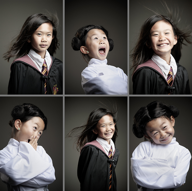
I hope my daughters grow into amenable subjects like this.
I should be more specific next time.
________________
Halloween is always a fun time of year for the kids, and choosing a costume is a big part of it. We had some rather interesting choices for costumes this year. Kristin chose to be Hermoine from the Harry Potter series, and Kayla chose to be Princess Leia from Star Wars. Kristin has been glued to the book series and is a big fan of Hermoine. Kayla chose Princess Leia, as she is always playing Star Wars with her classmates during recess. She's the only girl in the group when they play, so I guess she got assigned princess duty.
In response to my recent post about Charlie Fuqua — an Arkansas Republican who lauds the Hebrew Bible’s insistence on stoning disobedient children — a couple of very thoughtful commenters have suggested that my use of the term “cherry-picking” to describe Fuqua’s use of the Hebrew Bible might not be apt.
Their allegation is that Fuqua is simply an extremist fundamentalist who believes in a literal interpretation of the Bible and thus that he isn’t cherry-picking. I’m going to briefly defend my use of the term “cherry-picking” in this case, and in so many other cases where fundamentalist Christians read one part of the Hebrew Bible literally while ignoring all the rest.
My argument is that any time a law from the Torah seems difficult or unclear, these fundamentalists simply say that it’s unnecessary to pay attention to it because Jesus’ arrival on Earth supersedes it. These are typically laws or mitzvot that are incumbent upon individuals and that many Jews continue to practice (keeping kosher or celebrating the holiday of Sukkot, as innocuous examples). But the laws that never seem to be superseded are ones that Jews no longer adhere to (or haven’t adhered to for centuries in some cases); these also seem to be ones that are binding upon others (the death penalty, as an example) and that seem to fit with right-wing (political) positions.
In this sense, I read it as cherry-picking because it seems to me to amount to consulting a religious text that isn’t generally considered binding by this group in order to find laws or rules that fit their previously-held (political) positions and then using the authority of that religious text as justification for one’s beliefs about, say, vengeance or homosexuality or women’s rights or whatever else. The authority of the very same text does not apply to the strictures that might impact their own lives in the way that they desire to impact the lives of others.
The short version is this: Fundamentalist Christians — and most other Christians, I would venture to guess — view Christianity as radically different from Judaism. Their general rejection of the laws of the Torah thus makes a lot of sense to me. What doesn’t make any sense is turning to a religious text whose laws they generally reject in order to find support for positions they hold but that most adherents of that religion don’t hold. Imagine if I ignored virtually everything I’ve read in the Christian Bible because I don’t believe the central proposition of that text … but then I pulled out six or seven passages to justify some political position that I hold based on the authority of a religious text.
I was speechless when I heard over the phone, “You’re going to be busy for the next six months. You just won the Alexia grant.” It took a moment to recover, to say thank you, but it’s taken a little while to realize the significance. Alexia is a well respected photojournalism foundation and they have [...]
I have been getting a lot of questions on my Q&A blog about misc gear and accessories that I use a lot. This also comes at a time when I’ve been asked by eBay to curate a few of my favorite things that I have found there. I figured I could go ahead and pick ten of my favorite photography items that I use a lot but don’t talk a lot about. A lot of the things I get from ebay are grip accessories like clamps and such and odd ball items like lens converters.
#1 – C-Stand wheels – C-Stands are my favorite types of light stands. Especially when I’m working in a studio environment. They are strong, sturdy, and very versatile. You can put a lot of weight on them and sandbag them to your heart’s desire. They are a bit of a pain to move around once you get lights, modifiers, and sand bags on them though. These little casters help a lot with that.
#2 – Reflector Arm – This is my favorite style of reflector holder. They are adjustable to most common sizes of reflectors and infinitely adjustable. You can also take it off the stand and hand hold your reflector for a shot. I’ve tried several types of reflector arms and this kind is the best I’ve found.
#3 – Bogen Justin Clamp – Joe McNally turned me on to these indispensable little clamps. I’ve found no less than 25 uses for them so far. They are perfect little clamps for holding hotshoe flashes on anything from light stands, to tree branches, to parts of cars, to anything you can put that clamp on. They are lightweight and strong. Parts can be moved around and interchanged. I’ve put GoPro cameras on these, flashes, cables, client’s clothes, etc. I’ve also found a lot of use for them with my newly acquired Elinchrom Quadras.
#4 – Super clamp + grip head – I love all sorts of frankenstein grip heads like this. Putting a super clamp on any other kind of clamp is like the mix of chocolate and peanut butter. The grip head can be attached to any kind of post type of thing. Like a light stand or boom. Then you have a super clamp on the other side to clamp something on. Or you can clamp the super clamp on to some sort of object and then mount a stand or boom arm on to the grip head. You’ll find two super clamps put together like this. A super clamp and a knuckle. Etc. I love this stuff.
#5 – C-Bracket – The poor man’s steady cam. I don’t do a lot of video but when I do I like these little C Brackets as a poor man’s steady cam sort of thing. You can mount a camera to it and hang it out of a window, clamp a monitor to it, clamp another mic to it, etc.
#6 – Sand Bags- If you are doing anything with light stands you need some sand bags. Studio and location! Canvas Grip in California makes good stuff at great prices. Two of their items are on this list. Their sandbags are strong. Here’s a sand bag tip I learned from my old studio manager, Dan Depew. Carry empty bags with you to location and fill them up with rocks and stuff that you find there. Use the bags then empty them when you leave. I always have a few empty sand bags in my lighting case now.
#7 – 12×12 Silk – Canvas Grip has the best prices on large silks that I’ve found. I have 4 of these 12×12 silks, 4 of their black cutters, and 3 25×25 silks. A lot of these go into use in my studio to make HUGE light sources and/or partition the studio into different shooting areas if we have a lot going on. The 3 25×25 silks hang in my studio permanently. Silks can cost a lot of money. Thousands each. Canvas Grip has great poly silks at amazing prices. Whenever I need a frame for one of these big monsters I typically just rent them. You can also just string them up between two stands. Blow some light through them and it’s gorgeous.
#8 – Apple Box – I can’t tell you how important having some apple boxes around are. They can make small table tops for product work (put a board on 4 of them) they can be a posing stool, you can stand on them, you can have your subject’s stand on them. If you get a few full sized apple boxes you’ll soon wonder how you lived without them.
#9 – #10 – Lens adapters – Ever have a great lens that you love on one camera and wish you could use it on another? Thanks to the power of small manufacturing around the world people have been making all sorts of adapters lately. I have a few Hasselblad lenses that I love but I don’t shoot them on my 500c/m body all the time. I got a Hasselblad to Canon EOS adapterand I can now use my Hassy glass on my 5d. You have to manually stop the aperture down but it works. Folks are now making adapters to put other lenses on the Fuji X-Pro1 as well. I just ordered one to put my old Nikon lenses that I still have onto my X-Pro. I’m excited that my Nikon 105 is going to get some use again. I never sold that lens because I was so attached to it. Thanks to adapters like this it get’s new life. You can find all sorts of adapters that run from Mamiya to Nikon. This to that. Etc.
It’s a cool time to be alive in photography.
Cheers,
Zack
This post is part of eBay Finders, a new partnership that presents collections of items curated by a carefully selected group of electronics experts. Meet more of the Finders at ebayelectronics.tumblr.com. #eBayFinders
Beyond a certain level, the quality of a photograph is difficult to evaluate. Nevertheless, photographers are consistently put in positions where they depend on people such as photo editors and marketing professionals to evaluate their work. This might make you wonder how people assign value to something that is difficult to evaluate. You might reasonably expect them to understand the difficulty and find some means of accurately and objectively assigning value to your work. But a growing body of scientific literature suggests that this is not the case. When confronted with difficult judgments, people often ignore the aspects that are hard to evaluate and form a judgement based on easier attributes, even if those attributes are not really relevant to the value they are judging. And this all happens without anyone being aware of it.
An interesting example of this comes from Christopher Hsee's 1998 article 'Less is Better: When Low-value Options Are Valued More Highly than High-value Options' from the Journal of Behavioral Decision Making. Hsee describes a study in which two groups of people were asked how much they would pay for a serving of ice cream. One group was offered seven ounces of ice cream overflowing a five-ounce cup; the second group was given eight ounces in a ten-ounce cup. The first group was willing to pay on average $2.26 for their seven ounces of ice cream and the second was only willing to pay $1.66 despite the larger portion. Hsee's explanation is that when it comes to ice cream, cost per ounce is difficult for most people to evaluate. But most people have no trouble evaluating the relationship between cup size and contents. People substitute the easy heuristic of judging the relationship between container and contents without even knowing it and value the overflowing cup substantially higher.
An easy-to evaluate attribute, such as the overfilling or underfilling of a serving of ice cream, may have much greater impact on one's judgment than a hard-to-evaluate attribute, such as the actual amount of ice cream, even though any reasonable consumer would consider the latter to be more important.
When test subjects are offered both servings at the same time their preference reversed and they valued the under-filled cup higher because the relationship between seven ounces and eight ounces is now obvious and easy to evaluate.
Why should photographers care about this? Because we know that photography is difficult to evaluate, even for experts, and every time we present our work we also present a portfolio of attributes that are much easier to evaluate: our presentation, spelling, portfolio cover, website design, dress, etc. Hsee's study should make us very aware that when people are judging our work they may be using a heuristic based on attributes that we don't expect to be relevant — attributes that everyone would agree have nothing to do with the value of our work. And they may not even realize they are doing it.
In the same article Hsee describes a related study that compared two sets of dinnerware. One set contained 24 pieces all in good condition and the other contained the same 24 pieces in the same condition but also included 16 additional pieces of which nine where damaged. On average test subjects valued the smaller set at $32.68 and the larger set with broken pieces at $23.25 even though the larger set contained everything that the smaller set did and then some. The explanation is the same: it's difficult to appraise the value of a set of dinnerware on its own merits, but it requires no effort to understand that broken pieces devalue the collection. Subjects used the simpler attribute to arrive at a lower value for the objectively more valuable collection. The seller of the larger set would increase his profit by about 40% by throwing away the extra unmatched and broken pieces and offering the buyer less.
As a photographer this study should make you think long and hard about your portfolio and the work you present on your website. Photographers have always been advised to edit their work ruthlessly because poor work in a portfolio makes buyers wonder if they can consistently produce good results. This study goes further, however, and suggests that a couple broken dishes in your portfolio will bring down the entire value of your work including otherwise excellent photographs in the eyes of a buyer. This bias could be important to you even if you are only selling stock and not pursuing assignments. Less is better in ice cream, dinnerware, and probably portfolio images. If you have a few broken dishes in your portfolio, you're better off throwing them away.
But the kind of realism most distinctive of photography is not an ordinary one. It has little to do either with the post-Renaissance quest for realism in painting or with standard theoretical accounts of realism. It is enormously important, however. Without a clear understanding of it, we cannot hope
to explain the power and effectiveness of photography.
— Kendall Walton, Transparent Pictures: On the Nature of Photographic Realism
The image above is one-hundred percent fake. It has no connection whatsoever to the world of things. I created the bolts, lights, textures, and everything else in a free, open-source, relatively easy-to-use software package called Blender. It's easy enough that even a novice user like me is able to make a pretty convincing image. If you are a photographer that makes a living shooting still-life photos, this should scare you. There are many aspects of this workflow that are superior to anything you can do with a camera. It is resolution independent; it is simple to manipulate any aspect of it (including composition and light) after the fact; it requires no physical space to create, and needs only inexpensive, off-the-shelf hardware. And the subject doesn't need to be present at the shoot, it doesn't even need to exist. You can create imagery for advertising, public relations, and market testing before a prototype is built. The one thing it doesn't have that a photograph does is a connection to the real world.
For the first time in history, photography is about to lose control of its monopoly on affordable, convincing realism and it's time for us to understand that realism has never been the most important feature of the photograph. Although we rarely think about it, we understand this intuitively: a computer rendering of your daughter's wedding will never be the same as a photograph even if both are equally realistic. The photograph is defined by its causal, mechanical connection to the real world. Academics have studied this aspect of photography for a long time (for a very clear overview see Kendall Walton's Transparent Pictures: On the Nature of Photographic Realism), but almost from the beginning photographers have stayed blissfully unaware of theory and have systematically ignored and even undermined their medium's connection to the world.
Computer generated imagery and photography are on intersecting trajectories. While photographers employ tools like Portrait Professional that sanitize their portraits, making them look more like renderings, 3D artists are adding blemishes and developing tools like subsurface scattering to make their renderings look more like snapshots. Photographers are fighting to remove noise, CGI artists are adding it; photographers are using digital techniques like focus stacking to extend depth of field, while CGI artists begin with unlimited depth of field and artificially reduce it. At the moment photography is still the most affordable means to quickly create realism in most applications with notable exceptions in large scale cinema productions and car advertising. But the two worlds are about to merge and a large part of the photography industry will be replaced by software.
No water or iPhone needed. Even complex fluid dynamics are becoming relatively easy for someone like me to simulate.
The model as it appears on my screen in Blender.
Need a different angle? No problem, just re-render.
If your photography is primarily about creating visual fantasy, or showing a wished-for world—in short if it is fiction—then it is in danger of being consumed by CGI. Soon, perfectly realistic renderings, even of people, will be cheap and quick. If you are in a market like the fashion magazine industry, which is already indifferent to photography's connection to the real world, why would you deal with the protestations of supermodels when you can just begin with a CGI model instead—the hyper-realistic version of a dressmaker's mannequin who comes with an adjustable cup size and will never complain about her contract. As a photographer, if the connection to reality is irrelevant to your work—like it is in a lot of advertising, product, and even landscape photography—there is a good chance that a sixteen-year-old in Bangladesh will be able to produce marketable imagery for a fraction of the cost. And he won't need a 40-megapixel Hasselblad or studio full of lights. But if you traffic in non-fiction photography, if your work capitalizes on photography's one distinguishing feature, then a rendering will never replace your work. While nobody really cares if the shampoo bottle in a print ad exists or ever did exist, people do care about the connection between an image from a war front and the action it presents. They can't always explain why, but people understand the difference between a photograph and a rendering of the same subject even if the two are almost indistinguishable. It's the same difference we feel (to borrow Kendall Walton's example) when we look at Goya's Tanto y mas and Timothy H. O'Sullivan's photographs of the Civil War. It's not about the realism, but rather the fact that renderings and drawing can't bear witness in the way a photograph can. This is where photography distinguishes itself as a medium and it's time for photographers to embrace it.


.jpg)