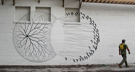
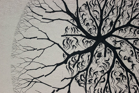
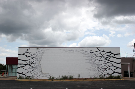
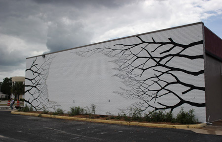
Stunning mural paintings createad by David de la Mano and Pablo S. Herrero. It’s good to see street artists adopt radically different styles. Via Colossal.
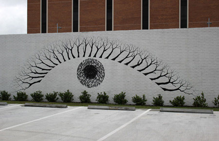
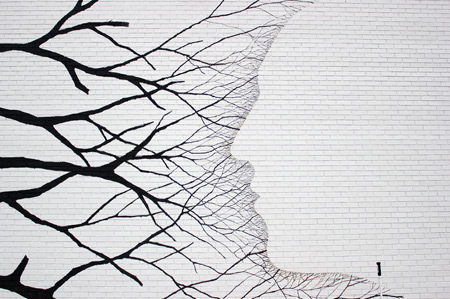
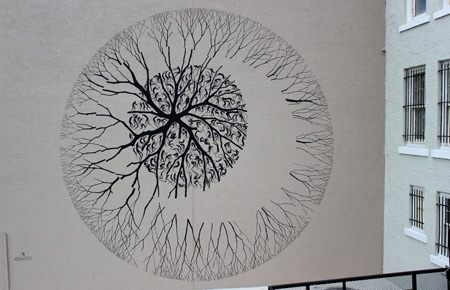
Stunning mural paintings createad by David de la Mano and Pablo S. Herrero. It’s good to see street artists adopt radically different styles. Via Colossal.


Architects: Space Group
Design Team: Adam Kurdahl, Gro Bonesmo, Gary Bates, Jose Hernandez, Eric Gerlach, Wenche Andreasen, Jens Noach, Anne Wordstrup, Frederik Kjelman, Tim Prins, Grant Cooper
Client : Signal Mediahus ANS
Consultants: Norconsult, Rambøll Norge, Energima, Ingenius Oslo, Franco Bløchlinger / Metallplan AS, 3D akustikk, Oslo El Prosjektering, F-Holm, Bleed, Sundt & Thomassen
Photography: Ivan Brodey, Vegard Kleven, Space Group
Area: 5,000 sqm
Year: 2012
Photographs: Ivan Brodey, Vegard Kleven, Space Group


In 2012, Space Group completed the refurbishment of a late nineteenth century industrial building designed by architects Ove Ekman and Einar Smith. This area along the Akers River was historically referred to as NY York (New York) due to its explosive development in 1858. Today the area reflects a transformation towards a district focused on art, architecture and design.
Signal Mediahus
Signal Mediahus sits next to the Aker River in Oslo. The original industrial building has a rich history of uses, from textile industry to offices and events. Part of the building burned down in the 1980s. The project inserts a completely new architecture inside the shell of the old while preserving the historic. The two correlates while both being clearly architecturally defined.

The Signal Mediahus hosts several film production companies under one large glass roof. The program is organized around a main void that brings light from a glass roof into the deep section of the building. The program is also organized around the availability of light: cinema rooms in the basement, edition rooms, studios and offices in the ground floor and offices on the upper floors, where more daylight penetrates the building. Different programs receive different material treatments.
The space in the basement is organized around a big black box that contains the cinemas. On the ground floor, two wooden cladded boxes hosts the studios and edition rooms, while generating common spaces in the gap between the existing façade and the boxes. The boxes also serve as acoustic absorbent for the Atrium. The upper floors are as open and transparent as possible, creating promiscuous visual connection between different tenants, encouraging exchange and collaboration.

The life of the building is around the common atrium: a lounge, meeting spaces, café, a vertical garden and a centrifugal circulation. The circulation is designed to maximize the interaction between the users and the experience of the space.
The building is designed in both plan and section as one large open space. This architectural solution allows for an efficient use of the energy and ventilation, reducing consumption and minimizing the need for ventilation technical installations that can prove difficult to integrate into historical buildings.

OCA
Our goal was to reveal the space where a discourse on art could be generated rather than represented. After years of exploitation, the space is again visible, the materials accentuated, and one new element is introduced, a large stair of massive wooden planks (Douglas fir). The stair acts as an auditorium and makes the transition between the OCA offices and the project space. The stair organizes the space in 3 zones, providing a room in the room for lectures and screenings, a reading room and Library of Norwegian Artist as well as the surrounding exhibition space. The project includes offices for the OCA administration, artist studios for OCA’s residence program and a 450m2 project space.

Kindergarten
As part of a the Nedregate 5-7 project, Space Group made the design for the “NY York Kulturbarnehage” (New York Culture Kindergarten). The space is built for children’s exploration and use. The scale is deliberately manipulated in a sequence of compressed and open spaces. The big, open room creates a frame where as variations in horizontal and vertical lines, creates intimate rooms for small groups and secret play, which are only available to and dimensioned for children. The kindergarten has four bases organized around a giant staircase for musical gatherings, theater, film, dance and play. In the back of the room lies a big curved wall that contains all technical installations. It’s made out of stainless steel and distorts the viewer’s image, just like the fun mirrors at the fun fair.


Nedregate Culture District / Space Group originally appeared on ArchDaily, the most visited architecture website on 08 Jun 2013.
send to Twitter | Share on Facebook | What do you think about this?

Architects: atelier dnD
Location: Khandala, India
Area: 20,000 sqft
Year: 2012
Photographs: Courtesy of atelier dnD


Living in the tropics is all about enjoying the nature and the climatic conditions. The unforgiving sun, the extreme humidity, the scent of earth just after the first showers and the relentless downpour that follows; the clear skies and the natural picture postcard landscapes often are the settings for the tropics.

Pa house has been designed as a cluster of pavilions held together by sun decks and verandahs. The house has a definitive front and a back- the front side is more intimate and private while the back visible from the driveway accommodates the paddock area and the stable. The front side accommodates the pool, jacuzzi pavilion and the large landscaped lawn where at one end sits a gazebo. The layout has been done keeping in mind that the spaces enjoy the vantage of the hills in the north.

The layout has clusters which have been given definition by roofs cape and scale of structure. The formal living dining pavilion which also house the master suites at upper level enjoys the maximum height in elevation. The entertainment block with its lean too roof is less than two storeys in height but its footer print more square establishes a larger volume. The roofs cape addresses the mountain range ahead. The guest wing is a string of rooms held together by a corridor for circulation and a common hip roof. Aligned with this structure is the utility and service block.

The pa house is an experience of inside outside spaces. The powder toilet volume surrounded by a lily pond, the transit between the living pavilion and the entertainment block with its shaded glass walkway, the several internal courtyards created for spa or outdoor shower areas all enhance a singular experience- being one with nature.

Architectural restrain in materials is evident with plain white plaster walls, dry wooden cladding and slate stacked walls, and shingles used in the roof.


PA_House / atelier dnD originally appeared on ArchDaily, the most visited architecture website on 09 Jun 2013.
send to Twitter | Share on Facebook | What do you think about this?
It's week twenty-two and I love this project.
click the photo to enlarge for a somewhat clearer image.
Week of : May 28 - June 2.
What happened this week? I was home and then some girlfriends came to town for the weekend.
Anything special in the spread? Nothing too exciting... I didn't have a ton of photos this week. What you see here is pretty much what there was to work with. Some weeks are like that. Other weeks I get to pick and choose.
Techniques this week : I created a little "embellishment" pocket with a Chic Tags tag and some Kelly Purkey sequins. I sewed the tag into place (right through the pocket) and sewed the pocket shut to keep the sequins in. On the backside of the tag I stuck a sticker that will appear in next week's spread.
Overall thoughts : Love the color mix this week. It's screaming summer to me. Also love when a layout comes together so easily.
Ratio of iPhone photos to "real camera" photos : 6 to 4.
Supplies used : Seafoam core kit, Kelly Purkey label sticker, sequins & 3x4 cards, Chic Tags journaling tag.
Tools used : Design A pocket pages, Fiskars corner rounder, Zig Millenium pen, Rotatrim paper trimmer, Office Depot date stamp, staz-on ink. All photos were printed at home on my HP Photosmart 2575 printer on Office Depot semi-gloss photo paper.
Project Life is a memory-keeping system created by Becky Higgins. I use photos, text and stuff to document our life weekly. You can see all the posts from 2012 here and 2013 here. Do you have a question about how I am tackling this project (including anything about the photos)? Check here.O que realmente mais gostei da incursão pelo parque Gärten der Welt (clique aqui para saber do que se trata) foi o Jardim Cristão, ou Christlicher Garten. O que era para ser apenas um jardim dentro de um parque é uma das instalações de arte contemporânea mais bacanas que já visitei.
Porque o parque já tinha um jardim taoísta (China), budista (Japão), hinduísta (Bali) e islâmico (Oriente), as pessoas começaram a se perguntar se a principal vertente religiosa da Europa não seria representada. Aí foram promovidos vários colóquios com especialistas em religião, teologia, paisagismo, história dos jardins e mídia, entre outros, que desenvolveram a ideia.
É como se fosse uma grande sala cujas paredes são vazadas e construídas por letras de metal, formando uma tela de textos. Há frases do novo e do velho testamento, obras filosóficas e de cultura geral, formando a sala da língua e das palavras. Quando o sol bate, as letras são projetadas no chão, formando um efeito belíssimo. Não dá vontade de sair do lugar; é inspirador demais.


Gostou? Quer ver mais fotos em resolução melhor? Clique aqui e vá direto no Flickr!


The JKC 1 House in the Bukit Timah neighborhood of Singapore from Ong &Ong is as sleek and sophisticated as you expect from the firm.
A wide open living space invites Singapore’s evening breezes in to the living area, with no boundaries.

Its interiors are polished and gleaming white, contrasted with the chocolaty richness of tropical woods.

A glossy black staircase connects a zen-like interior courtyard to the roof terrace.

This grey pebbled courtyard brings lavish daylight into the central part of the house.

This is open to the sky, and glassed in to make an outdoor area in the heart of the house.
On each side of the courtyard, entering or leaving the bedrooms, one would confront this central peaceful place.

At the end of the hallway, a light-filled and generous master bedroom combines contemporary refinement and Asian healing elements.

A very generous amount of space is used in traversing this large staircase-cum-courtyard with the bedrooms and playroom arrayed around it, but it is a key to the serene enjoyment of the spaciousness.

Coming down to the public space from this upstairs courtyard, the sudden formality of white marble steps across from the pool make a definitive contrast with the teak wood used upstairs.

These five marble steps – that from here appear more like an architectural feature than a staircase – are centrally placed on the back of the generous open plan living and dining area directly overlooking the pool.

A generous contemporary kitchen is towards the back of the house together with the garage.

The house is on a slight hill overlooking the pool in the front, following the feng shui belief of balancing the “mountain” and “water” elements.

On the ground floor, a massive urn dominates the spacious garden hallway containing the guest bedroom suite.
Somehow it signifies the aplomb with which Ong & Ong deftly dispatch yet another stylish Singapore home.


A trip to Singapore and here we are, in one of its most exclusive districts, , admiring the JKC 1 House, designed by a very interesting firm of architectur high class residence, adorned with natural elements, that compose a balanced Feng Shui environment, ideal for those who want to feel reconciled with their inner selves and prefer a peaceful lifestyle. The JKC 1 is a mix of The nature spreads and blossoms all around the house, becoming an important part of it.
The ground floor accommodates the living room and the dining room, offering an amazing view upon the front lawn. The daring thing and the element of surprise is the lack of windows, so basically the Besides the recharging doze of green, the house unveils a stunning swimming pool, right in front of the opened space. The transition from the interior environment to the exterior landscape is made through a wooden floor terrace, spreading like an extension of the house. The stairs, that connect the floor ground with the upper level reveal an interesting concept : “café latte”. The lower part of it is wrapped in white marble and the upper side in appealing brown wood. Wandering through the house, another staircase attracts the attention. Playful and meandering, it carries you from a feng shui spot, with small pebbles, rocks and slender trees up to the roof top. It’s kind of odd, but delightful. The roof top is a plain terrace, ideal for social gatherings, with friends and family
http://freshome.com/2012/10/03/enchanting-feng-shui-notes-remarkable-jkc-1-house-in-singapore/?utm_source=feedburner&utm_medium=feed&utm_campaign=Feed%3A+FreshInspirationForYourHome+%28Freshome.com%29
This is a post from Home Design Find
Ong & Ong Practice a Little Contemporary Feng Shui
 I have the beach on my mind and this cute beach souvenir terrarium in the Make It blog might just tide me over until I reach the actual tide.
It's a Friday afternoon. I just got off work, and I'm exhausted. I need to relax, catch my breath and get off the grid. I pack a bag with nothing but t-shirts and sweatpants. I drive about an hour and stop at a market to pick up some fresh produce. I drive a little more and pull into the driveway. I grab my bags and walk up to the door....of this home. And do nothing for 2 full days. yesssssssss..... (thank you John Robert Nilsson)


Light, bright, modern. Like a taste of sherbet or a slice of summer fruit. It's fresh, it's young, it's zingy and it's fun. Interiors by Dutch firm Depot Rotterdam.


June is kids and pets month here at Curbly which, as a self-proclaimed "Crazy Dog Lady" makes me really happy! While I love all animals and pets, today I'm focusing on the furry kind: cats and dogs. Check out my top ten picks for each and give your four-legged friends something to really bark (or purr) about!
First up, dogs! I have two and, when I'm not sharing DIY ideas and home decor inspiration on Curbly, I'm geeking out about all things canine on Dog Milk. So, obviously I'm excited to get a chance to share some of my favorite dog products with you. Check 'em out:

1. Stuff-able Dog Duvets by Molly Mutt
2. Collars and Leashes by See Scout Sleep
3. Modern Raised Feeders by DocaPet
4. Rope Ball Tug Toys by Waggo
5. Collapsible Travel Bowls by BlissPaws
6. Handmade Collars (over 150 available colors/patterns) by Mattie & Margot
7. Collars and Leashes (made from 100% recycled plastic bottles) by Waggo
8. Rope Animal Toys by Jax and Bones
9. Eco-Friendly Beds by P.L.A.Y.
10. Travel Carriers for Dogs and Cats by Sleepypod
And now for some fine design for felines! While I'm deathly allergic to cats, I'm still a design lover. Here are a few of my fave products for cool kitties:

1. Scratchdeck Cat Bed by Kittypod
2. Turbo Track Cat Toy by Bergen
4. Stackable Cat Tower by Bowsers
5. Pyramid Cat House by LoveThyBeast
6. Modern Cat Scratcher by Modko
7. Hemp Cat Pouf (filled with buckwheat hulls) by Kittypod
8. Re-Purposed Cork Cat Toys with Organic Catnip by HausPanther
Do you have a dog or cat? What are their favorite toys?
Tagged : cat, Curbly-Original, dog, Gift-Guide, Inspiration, pets, shopping guide
Material : fabric, metal, plastic, recycled, yarn & string
Design Style : colorful, contemporary, eclectic, minimalist
Room : living room, outdoor
Decor Element : accessories, Pillows & Cushions, textiles

Playgrounds have become pretty generic over the years. There are so many safety guidelines for children when considering building (safety is important!), that it's hard to step outside the box. Here are five unique playgrounds around the world that have managed to stand the test of time. Their modern and whimsical designs make them some of the most popular playgrounds today!

1. This egg-like playground was created by European sculptor, Egøn Möller-Nielsen. This large concrete playground is still popular with the kids in Tessin Park in Stockholm. Image via Wikimedia Commons.

2. This amazing playground is known as The Coaster in Höganäs. Built around a marina, this jungle gym replicates a sunken ship on the ocean floor. Read more about it and the designers at Monstrum.

3. One of the coolest playgrounds in Singapore is the Toa Payoh Dragon designed by Khor Ean Ghee. The body of the dragon is made from steel rails that form a tube-like passageway for kids to move from the head to the tail.

4. If you live in New York City, you may be familiar with the Silver Towers Playground. It was designed by Tom Otterness and reminds me of the tin man from The Wizard of Oz. You can even see how his mind worked behind the scenes of his sculptures!

5. Featuring a climbing tube and slide, what child or adult wouldn't want to hang out in the Sputnik Play Sculpture at the MOMA!
Have you visited any modern jungle gyms? Please share!
Tagged : Eye-Candy, playground
Design Style : mid-century modern, scandinavian

How do you turn a big piece of advertising real estate into something practical? By adding a curve and a fold or two, that’s how. Giving literal meaning to IBM’s Smarter Cities campaign, ad agency Ogilvy & Mather France seems to have found a way to get smart with urban advertising, turning a series of large-scale ads into, variously, a shelter, a seat and a ramp. They’ve even added evocative graphics—awning stripes, bench slats, traffic signage—to drive their point home. Sounds like one expensive ad campaign to us, but we like it!


Imags: Creative Review

Architects: SOSTUDIO
Location: Cancún, Quintana Roo, México
Project Architect: Sergio Orduña
Construction Company: Grupo Inconture
Area: 1,835 sqm
Year: 2011
Photography: Daniela Rangel


Cumbres Doce is an investment project located in a booming area in the center of Cancun. It comprises five separate houses, security gate and access control. The biggest challenge of the project was to locate the five units in an elongated lot with a narrow front and an extended background with party walls on three sides. The solution was to develop the main floor on the first level, leaving the services and storage areas at street level.

Thus the main floor extends the entire width of the lot, forming bridges over the roads for car transit inside the project. The layout of the plans is designed seeking the best orientation, ensuring direct sunlight on the pool and garden area, and natural cross ventilation by opening windows. An important feature of the project is the privacy and independence of each unit; each house has a garden area and private pool.

The modern-minimalist style chosen for the project tries to establish a difference by proposing a more contemporary approach to the idea of living in the Caribbean. The design concept is based on combining wide open spaces with the use of double heights and large sliding windows, creating a unique atmosphere by integrating interior and exterior in a single area.


Cumbres Doce / SOSTUDIO originally appeared on ArchDaily, the most visited architecture website on 08 Jun 2013.
send to Twitter | Share on Facebook | What do you think about this?

“The greatest American architect of all time”, Frank Lloyd Wright, was born 146 years ago today. One of the all-time architectural greats, his work has now been inspiring generations of architects for over a century.
Lloyd Wright is particularly interesting because of the unique period of history which he occupied: as a disciple of Louis Sullivan (‘form follows function’) in the late 19th century, his work forms something of a bridge between the traditional architecture of that era and the modernists which began to appear around the 1920s. His later work is formally modernist, yet still retains a sensibility rooted in that earlier period.
Frank Lloyd Wright is for many people the quintessential vision of the architect: he presented himself as a lone genius, fastidious down to the smallest details of his design, and his personality was often rather brash; if it weren’t for the fact that he was almost always right, he might be seen as arrogant. But there is no denying his vision – and the timelessness of his designs continues to reveal just how strong that vision was.
On the occasion of his birthday, we invite you to take in part of the legacy that Frank Lloyd Wright left behind:
Happy 146th Birthday Frank Lloyd Wright originally appeared on ArchDaily, the most visited architecture website on 08 Jun 2013.
send to Twitter | Share on Facebook | What do you think about this?
Playground is a Prague-based production studio that often mixes 3D renders, photography, and concept art to create really amazing composite images. In this article, we will show a few of our favorite works from their portfolio, as well as a few progress images for some of the pieces.


“If you’re not living a life on the edge you’re taking up too much space! … You learn the most when you’re out of your comfort zone!”
- Jim Whittaker
Taken from this short by Eric Becker.
Even though I never use maps in real life (and heavily rely on my car's GPS to get around), I've been obsessed with maps lately and the different ways that they can be presented. I'm loving the work of illustrator Masako Kubo. The way she draws maps make me want to wander around whatever city or area she's capturing.
Antes de mais nada aumente o som e … OUÇA o bolo …
Nunca escrevi uma palavrão aqui … mas dessa vez não tem como.
Se bem que “Puta Que Pariu”nesse caso não é um palavrão, é um elogiu … é a unica coisa que da vontade de falar depois de colocar um pedaço desse bolo na boca ….
E aí eu tava falando pra Rê esses dias de bolo, de chocolate e ela perguntou se eu já tinha feito o Bolo PQP .. Hein?
Não … mas agora preciso.
3 ou 4 dias depois (ontem a noite) … ela pipocou aqui em casa ontem a noite pra gente fazer uma sopa BOA de milho verde, maça verde, curry e amor E o bolo PQP.
Ta aí o resultado … da pra ver E ouvir <3
Na verdade isso não é um bolo, é uma declaração de amor à vida vestida de chocolate <3
É uma daquelas coisas que quando alguém faz pra voce, você tem certeza que essa pessoa no mínimo te quer MUITO bem.
Não tem como não colocar amor … e aí você sente o amor quando come …
Sabe um bolo que te inspira??? É ele!

E aí como acreditamos que alegria, amor, carinho e felicidade precisam ser shareados com o MUNDO todo …
A Receita
Ingredientes:
USE os melhores ingredientes possíveis … pode confiar, esse bolo merece seu melhor café, seu melhor cacau, chocolate, ovos caipira, etc …
- 500g de chocolate meio amargo
- 125ml de conhaque, licor de café ou café puro
- 125ml de água
- 15 de cacau em pó, peneirado
- 200g de manteiga sem sal
- 150g de açúcar
- 10 ovos, separados
- 70g de farinha de trigo, peneirada
- 1/4 de colher de chá de cremor de tártaro
Preparo:
Pré-aqueça o forno a 150°C.
Prepare uma forma redonda de 25cm* da seguinte forma: cubra com uma camada dupla de papel alumínio e unte o papel alumínio com manteiga.
Numa tigela grande, coloque o chocolate, o conhaque ou o licor de café, a água, a manteiga, o cacau em pó peneirado e 100g de açúcar. Leve a tigela ao banho maria, e mexa até o chocolate derreter e a mistura ficar homogênea. Retire do fogo e reserve até esfriar.
Na batedeira, em velocidade máxima, bata as 10 gemas até virarem um creme branco e espesso. Agregue delicadamente as gemas na mistura de chocolate e em seguida agregue a farinha, mexendo delicadamente com uma espátula.
Bata as claras em neve com o cremor de tártaro, até ficarem em picos firmes. Adicione gradualmente os 50g de açúcar restantes. Agregue delicadamente metade das claras batidas em neve na mistura de chocolate e em seguida, agregue o restante. Coloque a mistura na forma preparada.
Coloque a forma dentro de uma assadeira grande e coloque água quente até metade da forma. Asse em banho-maria por aproximadamente 1:15h – 1:30h ou até que você espete com um palito e ele saia limpinho.
Retire do forno com cuidado e espere esfriar completamente na forma antes de desenformá-lo. O bolo dá uma encolhida ao esfriar.
Preferencialmente, desenforme o bolo apenas no dia seguinte para o sabor se intensificar.
–
por Renata Damasio
@mammafoodie
if you´re afraid of butter, use cream;

The latest from Maxthreads Architectural Design and Planning, this proposal for the Taichung City Cultural Center serves as a cultural hub for visitors, locals, major community gatherings, tourism, and events. An expression of the city’s appreciation for the outdoors, the open architecture and green areas make it an intersection of nature and innovative tech.
Taichung City Cultural Center defines the northern arrival gateway to Taichung Gateway Park, providing a public hub to the overall master plan. The Taichung City Cultural Center portrays our vision as the threshold for Taichung Gateway Park. An iconic visual corridor connects local and international arrivals (Transportation Center) to the main cultural district of the city through a revived, vibrant public space.
The Taichung Inverted Cone:Incorporating interactive, mixed-use public spaces, recreating boundaries between each program, while defining a new typology of Library and Fine Arts Museum: ‘The Galibrary.’ The architectural expression for Taichung’s City Culture Center – Galibrary has been inspired by the uniquely beautiful mountain-scape of Taroko Gorge National Park, Taiwan.
Designing from their dramatic multi-level void spaces, these landforms establish a gateway to landscape beyond. Maxthreads’ proposal, therefore, introduces a strong relationship between the exterior and interior public spaces integrating into the Taichung Gateway Park.
The Taichung City Cultural Center is designed thoroughly in conjunction with Taichung Gateway park, and includes the integration of culture, education, tourism, environmental conservation, carbon reduction, energy conservation and sustainability.
Designer: Maxthreads


-
Yanko Design
Timeless Designs - Explore wonderful concepts from around the world!
Shop CKIE - We are more than just concepts. See what's hot at the CKIE store by Yanko Design!
(Green Gateway was originally posted on Yanko Design)
Related posts:
    
|
A técnica do cartão preto é utilizada para conseguir fotos bem expostas em situações onde um pedaço da foto está muito mais claro que o outro. Usamos essa técnica principalmente em momentos como no nascer do sol ou pôr do sol, quando a exposição do céu fica muito diferente da exposição da paisagem. Usar o cartão preto é uma forma fácil de já ter uma foto bem exposta sem precisar contar com a edição no Photoshop ou no Lightroom.
Não sabe o que é exposição? Baixe a apostila Aprenda a fotografar em 7 lições para aprender!
Vamos ver um exemplo? As fotos abaixo foram feitas um pouco antes do nascer do sol. Quando eu queria que o céu tivesse detalhes, ela ficou assim:

Para conseguir os detalhes da paisagem, no entanto, tive que aumentar o tempo de exposição. Consegui os detalhes do banco… Mas perdi o céu:

Usando a técnica do cartão preto, no entanto, consigo uma foto que tem a exposição correta tanto no céu quanto na paisagem:

Foto por Claudia Regina - Veja o EXIF completo desta foto no 500px
A técnica é muito simples: com a câmera em um tripé, você segura um objeto preto na frente da lente, cobrindo a metade mais clara da foto. No final da exposição, é só tirar o cartão e deixar a parte mais clara ter sua exposição correta.
Vamos para um passo a passo mais detalhado:
1. Faça a medição da fotometria tanto para a parte clara quanto para a parte escura, mudando somente o tempo de exposição. No exemplo da foto acima, usando ISO 100 e f/8, tive uma exposição de 30 segundos para a paisagem e de 3 segundos para o céu.
2. Escolha a exposição mais longa (neste caso, 30 segundos) e coloque o cartão preto na frente da lente, cobrindo somente a parte mais clara do quadro. Olhe pelo visor ou use o LCD para checar se o cartão está cobrindo de fato a parte que você quer.

3. Aperte o botão do obturador para começar a fazer a foto. Conte os segundos que se passaram e, quando faltarem os segundos da exposição mais curta, tire o cartão de frente da lente! Contar de cabeça pode ser um pouco complicado, então use um cronômetro (como o do celular.) No caso da foto de exemplo, tirei o cartão quando meu cronômetro chegou em 27 segundos (30 segundos da exposição da paisagem menos 3 segundos da exposição do céu.)
4. Pronto. Sua foto foi feita usando duas exposições diferentes e ficou linda! :-)
Essa técnica só funciona com exposições longas, pois é humanamente impossível tirar o cartão no meio de uma exposição de meio segundo, por exemplo.
O nome é “cartão preto” mas você pode usar qualquer coisa que bloqueie a exposição do sensor da câmera: só precisa ser um objeto plano, preto e fosco. Nestes exemplos usei um caderninho de anotações com capa preta que sempre carrego comigo.
Se você tem um disparador remoto é uma boa ideia utilizá-lo: você pode selecionar a opção bulb e contar o tempo direto no cronômetro.
Enquanto está segurando o cartão na frente da lente, tente fazer pequenos (bem pequenos mesmo) movimentos circulares para que a foto não saia com uma linha muito definida da diferença de exposição.
Existem filtros que fazem algo muito parecido com esta técnica: são os filtros graduados de densidade neutra (ou, simplesmente, ND-grad.) Eles também compensam a exposição de uma metade do quadro. A vantagem do filtro é a facilidade de uso. As desvantagens são limite de stops (normalmente só até 3 stops) e localização do gradiente (dá pra colocar o cartão mais pra cima e mais pra baixo, ao contrário do filtro.)

Também dá pra lidar com situações de grande diferença de luz na edição. A forma mais conhecida é usando a técnica HDR (aqui você pode ver um guia que escrevi sobre esta técnica.) Se a diferença de luz for em áreas esparsas da imagem, é legal usar HDR. Se for uma diferença bem definida, no entanto, usar o cartão preto pode ser mais prático pois a foto já sai pronta.

Você já tentou esta técnica? Quais outras usa para fotografar paisagens? Nos conte no fórum do DDF no Facebook :-)
Luciana PimentelQuero pra mim! <3
I absolutely adore when scrapbooking is mentioned in the general media, even though they’re usually making fun of us. But that’s okay because, you have to admit, a lot of the things we scrapboookers do is pretty wack. And sometimes really, REALLY wack. So we deserve all the pointing and laughing. We really do.
I mean, WHO DOES THIS!?!?!?

Crazy people, that’s who.
{Myself included}
{I’m not making fun of Katie. I adore her room and am jealous of it. I just wanted to show a scrapbook room and hers is way purdier than mine}.
I had a nice laugh at this recent ARTICLE from a Joplin, MO newspaper.
I loved the “cricket or some kind of insect” part and also about his wife’s pre-done vacation album :) He sounds like a good scrapper’s husband … even if he has to take out a restraining order on his paparazzi … er, wife … when they go on vacation.
What could you relate to in the article?
PS: Thank you to REBECCA, one of my SnY peeps, for sharing this article!
 Note: Larger version HERE so you can't blame not being able to name them all on not being able to see them.
This is Star Cars, a poster of 77 famous vehicles drawn by artist Scott Park. Can you name where each is from without looking at the legend? Because I did. Just kidding, I cheated. And you know the last time we played Monopoly during game night at your place? "You cheated then too?" No, but I am the one who clogged the toilet in your bathroom.
Thanks to justin and Side Effect, who were more than a little disappointed the car and red tractor trailer from Spy Hunter didn't make the cut. Right? Now how am I supposed to get the oil slick?
Note: Larger version HERE so you can't blame not being able to name them all on not being able to see them.
This is Star Cars, a poster of 77 famous vehicles drawn by artist Scott Park. Can you name where each is from without looking at the legend? Because I did. Just kidding, I cheated. And you know the last time we played Monopoly during game night at your place? "You cheated then too?" No, but I am the one who clogged the toilet in your bathroom.
Thanks to justin and Side Effect, who were more than a little disappointed the car and red tractor trailer from Spy Hunter didn't make the cut. Right? Now how am I supposed to get the oil slick?

The Wander Postcard Project is the brainchild of the team at social media start-up Wander. They asked some of their favourite designers and illustrators to imagine a postcard from everywhere and nowhere at once. There were 58 contributors in total including the likes of Dan Cassaro, Fuzzco, Tim Boelaars and Matt Chase, to name a few. With such a talented group of contributors it’s no wonder that the results were pretty special.
An added bonus for fans of the project is that each postcard can be downloaded as a hi-res iPad or iPhone wallpaper.
Check out some of our favourite postcard designs below:


Which of these postcards is your favourite? Do you have a similar side project? Let us know in the comments.
| Improve Designer Communication with MicroPersonas – only $17! | |
 This is the $40 Han Solo light switch plate hand sculpted and for sale by Etsy seller WickedStudio. And no, the boner isn't a coincidence, they did that on purpose because apparently I'm not the only one who understands fine art.
The Force is hard with this one. This is a working UL approved switch installed in the crotch of an icon of pop culture, Han Solo in Carbon Freeze. I hand-sculpted the switch plate to an appropriate scale for the switch and in the likeness of Harrison Ford. It installs directly to the wall over an existing switch outlet.Rumor has it Carrie Fisher has one of these in her bedroom and it always takes her twenty minutes to turn off the lights before bed. And can you blame her? It would probably take me twenty-five and I bet some nights I would still stand there in the dark holding on. Hit the jump for shots from all angles like you didn't just already buy one.


 Thanks to Dan and p0intless, who turn out the lights the old fashioned way: throwing something at the lamp until it breaks.
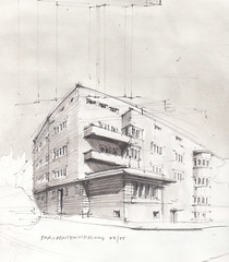
Daniel Castro Alonso adicionou uma foto à galeria:
Edificio construido en 1919 por el arquitecto municipal Antoni Pascual Carretero, en El Prat de Llobregat.

