    
|
Floogee
Shared posts
30 Jan 19:17
ArtsBeat: Behind the Poster: ‘Yentl’
by By ERIK PIEPENBURG
FloogeeHey, it's my bestie Brian!
A look at the poster design for the Cleveland Play House production of the play “Yentl,” about a young Jewish girl who disguises herself as a boy.


29 Jan 21:31


Russian Placards
by peacay
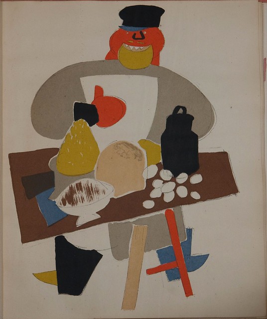
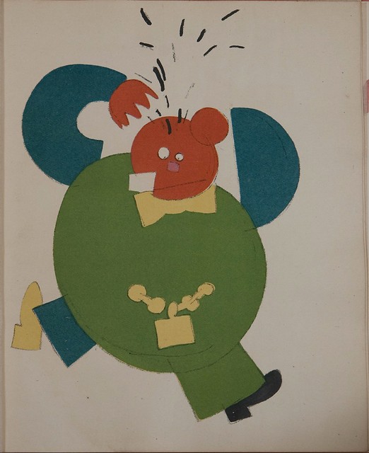
FloogeeMan, did Lenin mess up a lot of great art
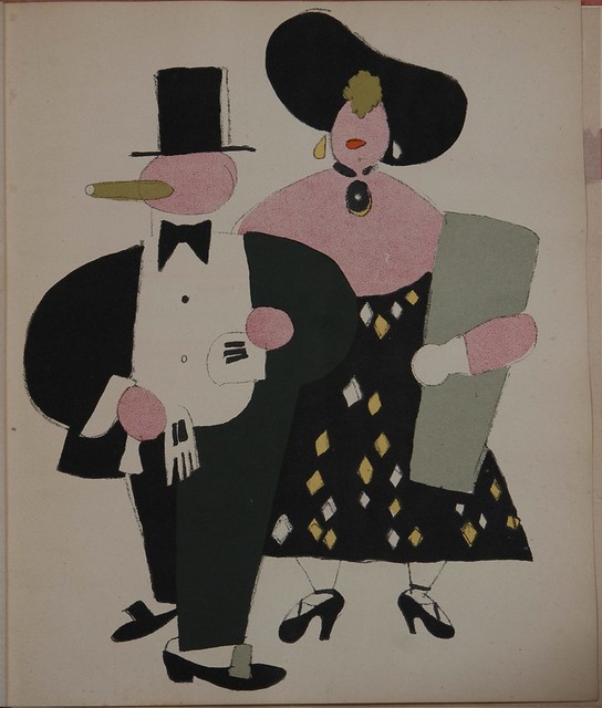
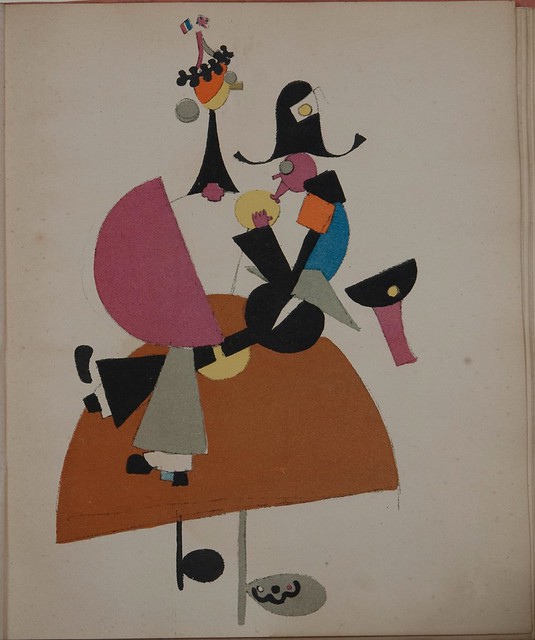
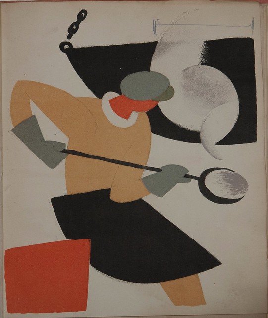
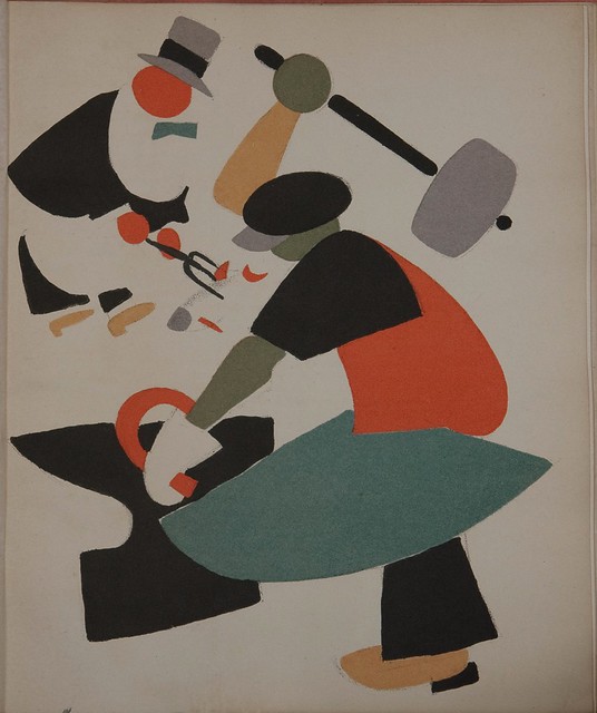
Propaganda lithographs from
'Russian Placards, Placard Russe 1917-1922'
by Vladimir Lebedev, 1923
"The activities of the painter, designer, illustrator, and constructivist, Vladimir Lebedev, encompass a very broad period: from the early 1910s through to the early 1960s, and, consequently, his stylistic [oeuvre] connects with many different trends and avenues of inquiry. In fact, Lebedev started his artistic career as a graphic designer when he was only 14 years old by designing postcards for the Fietta Art Store on the Bolshaia Morskaia in St. Petersburg (his home town); and only a few years later he was already a prolific illustrator of popular and children's magazines[..]
Consciousness of the material of the work (the ink, the print, the lightness of the paper, the brilliant color of the poster's chromolithography) is [..] a condition that unites the various artistic experiences and concerns of Lebedev's career. For example, Lebedev's activity as a caricaturist for the St. Petersburg satirical journal, 'Novyi Satirikon' (New Satyricon) might seem to be quite contrary to his experimental compositions for the posters that he designed for Okna ROSTA (the display windows of the Russian Telegraph Agency) just after the Revolution.
Chronologically, no more than two years divide these different endeavors since Lebedev began to work for 'Novyi Satirikon' in 1913, intensifying his contributions in 1917-18, while in 1920 he was already invited to participate in the Petrograd Okna ROSTA. Visually and stylistically, the two collaborations are very different, but, nevertheless, they both derive from a single sense of the integrity and inner logic of the graphic materials being employed."
['A Public Art: Caricatures and Posters of Vladimir Lebedev' by Nicoletta Misler IN: The Journal of Decorative and Propaganda Arts, Vol. 5, Russian/Soviet Theme Issue (Summer, 1987), pp. 60-75.]
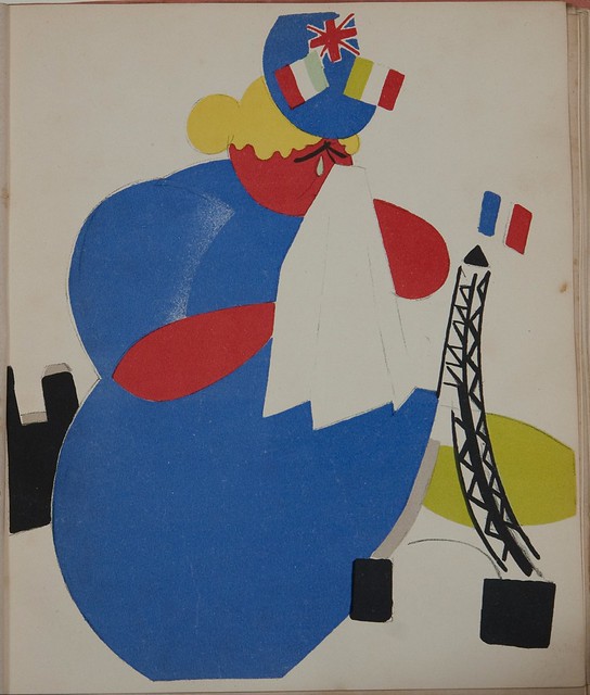
The lamentation of the Entente
The union of village and town (workman and villager)
The red vision of Communism is brushing over Europe.
The placard represents the bourgeois saving themselves from two workmen.
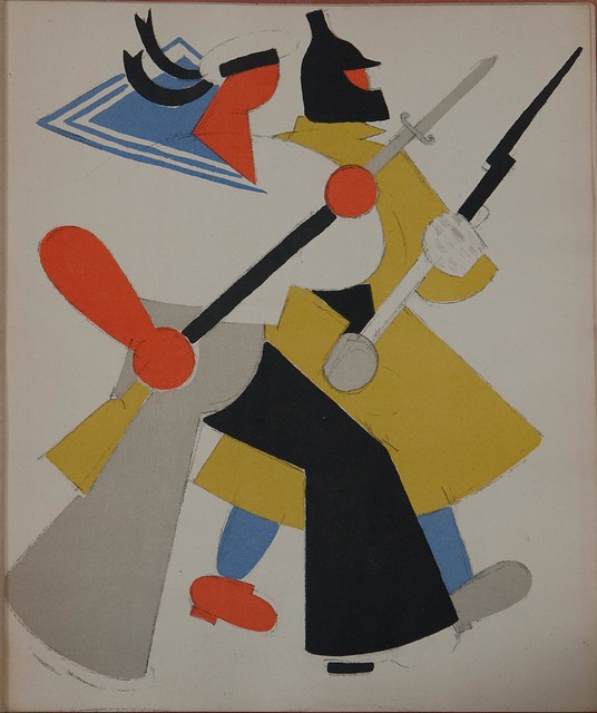
The Red Army and Navy defending Russia's borders.
The new bourgeoisie In the Republic of labour (threat to the proletarian State)
The Entente gives suck to Koltchak. Entente— a puppit (sic)
decorated with a garland and the Tower of Eiffel,
the latter with British and French flags on It. Koltchak
in a three-cornered a pistol case on his back.
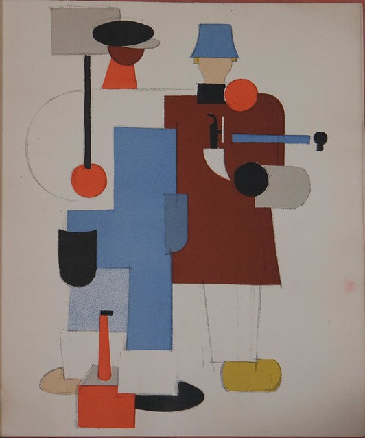
Productive propaganda.
A caster with a casting spoon in his hands, a mould in the left corner.
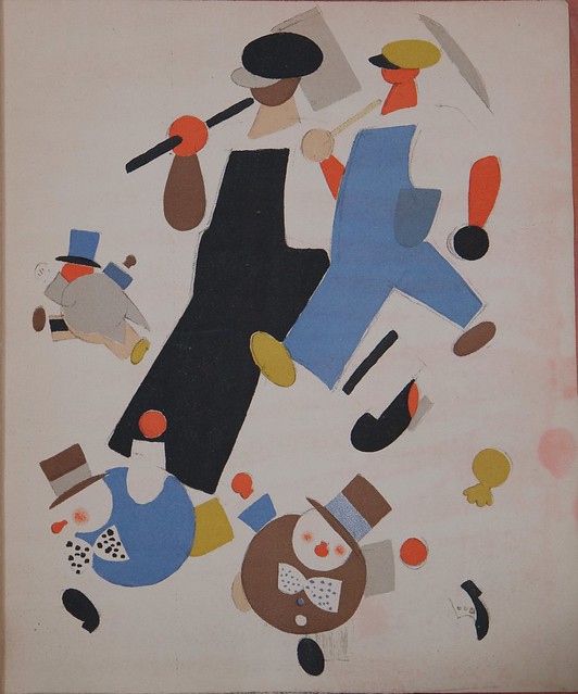
Agitation for utilizing the bourgeoisie for proletarian purpose.
The bourgeois in a grey top-hat and apron waits
upon the workman (feeds him with fish).
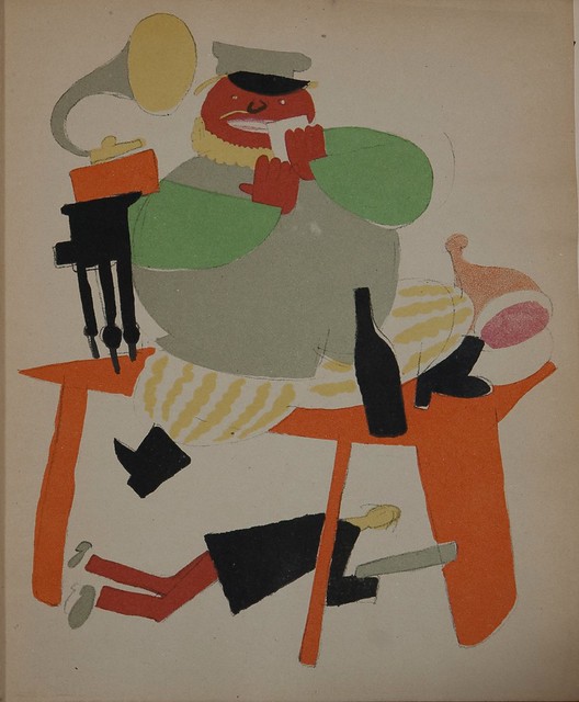
Agitation for the closing of markets- "the marauder in heaven and the simpleton in hell".
The placard represents an owner of a market- stall sitting in a grand house
at a table with provisions and a gramophone standing on it,
while a starving citisen under the table is defending the markets.
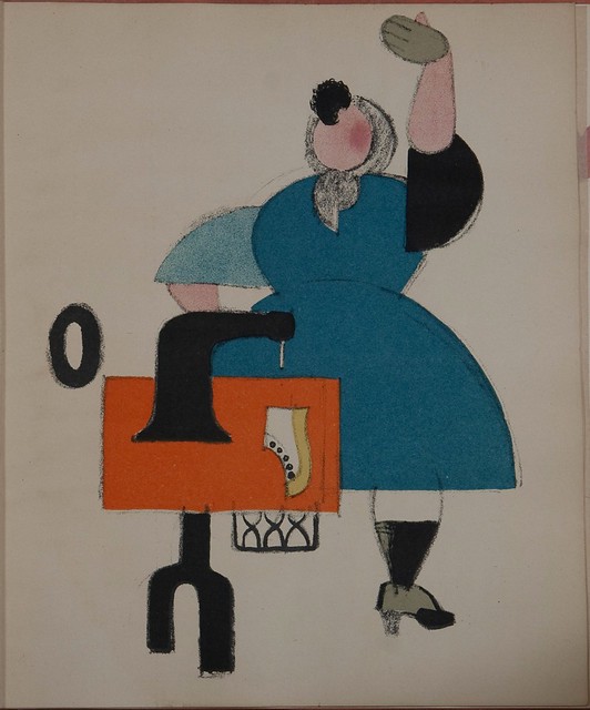
A work-woman. (Raising productivity through joining
together small hand-working and trade industries).
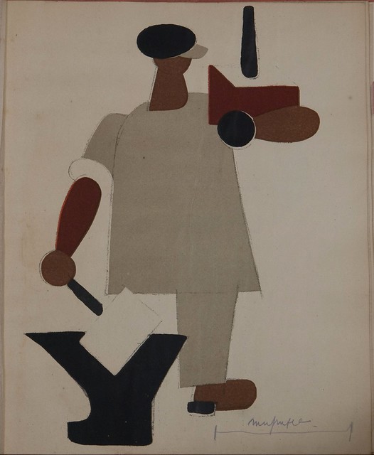
A workman with nationalised entreprises in his hands.
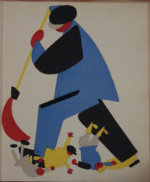
A workman sweeping the criminal elements out of the Republic (work conrol).
A marauder at a stall with wares (the struggle against sale in the streets).
A bourgeois tearing his hair on account of the
second meeting of the International Congress.
"In contradistinction to the satirical drawings of 1913-18, which, basically, still derive from the Decadent culture of the European and Russian Fin de Siècle, the ROSTA posters of 1920-22
rely on different external stimuli. These examples of "public art" are organized according to the juxtaposition of simple colored masses floating against the white background of the paper, i.e., they depend upon a much more abstract and austere formal arrangement for their effect.
True, some of the ROSTA posters are also satirical and caricatural, but they are very different from the drawings in 'Novyi Satirikon'. For many reasons, they signalled a turning point in Lebedev's artistic biography, and it is not by chance that they evolved after his encounter with cubism."
['A Public Art: Caricatures and Posters of Vladimir Lebedev' by Nicoletta Misler IN: The Journal of Decorative and Propaganda Arts, Vol. 5, Russian/Soviet Theme Issue (Summer, 1987), pp. 60-75.]
{for clarity, some very minor grammatical changes were made to the quotes by Misler}
- 'Russian placards, 1917-1922' by Vladimir Lebedev, 1923 is available in html and pdf formats from Dartmouth College Library. (the images above derive from the html layout - they have been cropped back to the page margin and the colour saturation has been bumped up lightly)
- 'Russian placards, 1917-1922' by Vladimir Lebedev 1923 is also available in full from the Wolfsonian-FIU Miami website [thumbnail images of the whole book including all approx. 26 lithographs]
- MoMA biography of Lebedev | Wikipedia |
- Russian Placards by Lebedev at Amazon.
- An original 1923 edition of Lebedev's Placard book sold for >$US4K in 2000.
- British Library - Russian Posters research site.
- **Ne boltai!** "This website provides thousands of selections from a large archive of political propaganda—mainly works on paper—produced by artists in the Soviet Union and its satellites" (note exhibitions!).
- Large collection of digitised Russian futurist books from the State Public Historical Library of Russia (via Ptak Science Books post --> @ptak).
- Thanks KH! I owe you a vodka. Or 3.
- This post first appeared on the BibliOdyssey website.
Spike55151 likes this
29 Jan 21:30


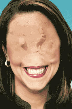
Why You Should Not Buy This Painting (So That Michael Connor Can)
by Michael Connor

Austin Lee, Profile Picture (2013). 11" x 14" Acrylic on canvas.
Postmasters Gallery is now showing a solo exhibition of work by Austin Lee, a young painter whose work you should really not purchase. If his prices remain flat for long enough, it's possible that in the future, when all my babysitting bills are paid, I might stumble across it in the Postmasters sub-basement and offer whatever I happen to have in my wallet. Recent history shows us that the artworks that I have come to own do not significantly appreciate in value. Therefore, an important tip to prudent buyers: do not purchase this painting, or really any other painting by Austin Lee. Are you following my logic?
Anyway, this painting by Austin Lee deserves to languish in the obscurity of my personal collection because it somehow captures so well the haphazardness of digital image culture. What I mean by this, partly, is that it's blurry, and I like blurry artworks. There is, by now, a proud art historical tradition of blurriness in representations of technological imagery: Vija Celmins, Gerhard Richter, Thomas Ruff. All these people have offered us works (in painting or photography) depicting familiar scenes or objects mediated by the distorting effects of popular culture.
In Profile Picture, the distorting lens of technology is more than a mere visual filter. It's not just a blurry painting, but it seems to have unhinged the object of the painting itself. The work is partly a careful replication of the blurring effects of a smartphone, but it's also more than that. This Profile Picture represents a discombobulated subject, a person in anxious movement, eyes bulging from screen burn, hair and clothing in the latest garish netart colors. The technology does not only blur the image, it also blurs the person.
This blurry netart person, this one-eyed jack from a deck of cards designed in MS Paint, speaks to me in a way that a lot of internet-aware painting does not. Profile Picture conjures both the aesthetic of an era of pocket snapshots and generally haphazard image-making, and the need to stage public identity in a manner that makes a bold impression, but leaves our outlines indistinct.
In short, savvy collectors should stay well away.
07 Jan 12:26


Smart Bracelet That Measures Sun Exposure Is Gorgeous
by Samantha Murphy Kelly
Floogeethat's perfect for you
LAS VEGAS — A new connected bracelet from a designer behind the Harry Winston and Louis Vuitton brands keeps track of excessive sun exposure and lets you know when you've had enough.
The June bracelet — from Netatmo, known for its personal weather station monitors — is the first bracelet to measure the sun's impact. The device was launched on Sunday at the 2014 International CES show in Las Vegas.
See also: 10 Free iPhone Apps You'll Use Every Day
The jewel on the wristband syncs with an iOS device and alerts users when the skin has had too much exposure to the sun. It also monitors UV intensity, tracks daily habits and advises women how to better take care of their skin. The app also calculates the maximum sun exposure for your specific skin type and reveals details about how much impact it's had throughout the day. Read more...
More about Tech, Mobile, Travel Leisure, and Netatmo
23 Dec 17:21
The proper way to make Buckeyes
by floogee
FloogeeSoooooo freaking good!

Every Christmas my Mom would start making these beginning in early December. At her height was was boxing up like 20-30 tins of them for friends and family.
Yesterday for Sunday dinner I dusted the recipe off and Kelly and I made a batch. They came out perfectly! It’s such a simple recipe so I’ve decided to share a long locked down Briggs secret. I don’t think Ma will mind.
BUCKEYES
Blend 4 cups of crunchy Peanut Butter with 1 lb. of softened butter and 3 lbs. of powdered sugar.
Roll into small balls and freeze till solid. Using a toothpick, dip them into 5 lbs. of melted chocolate discs leaving the top exposed.
Rest on wax paper till cooled. Serve
Nylonthread likes this
12 Dec 19:53


The Zombie Apocalypse Would Get Way More Trippy
FloogeeFucking brilliant!
Submitted by: Unknown
ThePrettiestOne, Floogee and 7 others like this
11 Dec 18:38


Star Trek: The Next Generation’s Uniforms Were Smelly, Painful Nightmares
by Nathan Birch
Floogee"So yeah, next time you’re watching TNG make sure to imagine the lingering scent of Worf’s ball-sweat in the air at all times."
 “How much longer do we have to stand so close to each other?”
When Star Trek: The Next Generation debuted in 1987, it introduced the world to a new Star Fleet uniform — the sleek, tight fitting, one-piece jumpsuits of TNG certainly looked more futuristic than the miniskirts and Beatle-boots of The Original Series, but they were also an absolute nightmare to wear. The bunched, they clung, and according to TNG costume designer Bob Blackman, they absolutely reeked…
“Spandex retains odor, so there is a certain part where if you’re wearing them for a long period of time, you can’t really clean all the smell out, and it becomes a little bit annoying. And it also retains the odor of the dry cleaning fluid. It is, on a day-to-day basis, unpleasant.”
So yeah, next time you’re watching TNG make sure to imagine the lingering scent of Worf’s ball-sweat in the air at all times.
According to Blackman, the final straw for TNG’s original uniforms wasn’t the smell, but the fact that they gave most of the cast terrible back issues. Starting with season 3 the cast were given somewhat more forgiving outfits.
Hmmmm, maybe TNG’s terrible uniforms were to blame for Riker’s completely deranged sitting habits?
via Observation Deck
11 Dec 18:37


Chef David Chang Wants To Use Kickstarter To Try To Buy The Redskins From Dan Snyder
by The Cajun Boy
FloogeeWho's in?
(via Getty Image)
Though he’s only 36 years old, David Chang’s culinary talents are already somewhat legendary. Under the umbrella of his Momofuku restaurant group, Chang presides over some of the world’s best eateries, including Momofuku Noodle Bar, Momofuku Ssäm Bar, Má Pêche, Milk Bar and Momofuku Ko in New York City, Momofuku Seiōbo in Sydney, and Momofuku Noodle Bar Nikai, Daishō and Shōtō in Toronto. Additionally, he launched a food magazine, Lucky Peach, in 2011 and it’s possible you’ve seen him on HBO’s Treme and/or on Top Chef.
That said, Chang’s passion for food might be only rivaled by his passion for football. The Virginia native who attended Georgetown Prep is a big Washington Redskins fan, and, needless to say, like most Redskins fan he has had enough of incompetent/arrogant Redskins owner Dan Snyder. So last night Chang made a proposal via Twitter: try to use Kickstarter to raise enough money to make Snyder an offer he can’t refuse.

Now, the Redskins were valued at $1.7 billion by Forbes recently, but who’s counting? All it would take would be for each DC-area resident to pledge a few bucks, as Kickstarter itself pointed out in a tweet responding to Chang.

This could get interesting.
04 Dec 20:11


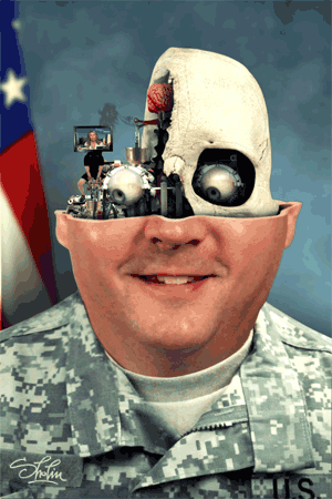
Milos "Sholim" Rajkovic: surrealist, Gilliamesque animations from Serbia
by Cory Doctorow
FloogeeThanks Heather. This kind of stuff is right in my wheelhouse
Milos "Sholim" Rajkovic is like a Belgradian anti-war Terry Gilliam, who produces the most remarkable surreal animations made from decomposed heads -- authority figures like generals and ranking clerics are a favorite -- filled with weird gears, fleshy pulsing puckers, crazy clocks, tiny frantic people, and more. I could watch this stuff all day long.
His Youtube channel is fun (the little squeaky noises add a surprising amount to the animation), but really, this is animation whose native format is the GIF, so be sure you check out his Tumblr.
He's pretty articulate, too, despite the language barrier: "its irresponsible to leave for future generations internet full of cute animals."
(via JWZ)

|
|
Binaryjesus likes this
04 Dec 19:51
OMB Puts Shutdown’s Federal Payroll Cost at $2.5 Billion
by Charles S. Clark
Feds took a total of 6.6 million furlough days; lost productivity not tabulated.
04 Dec 13:10
Cats That Look Like Pinup Girls (24 Pics)
by StomachPunch
FloogeeYes, I have rediscovered the reader once again. Uh, huh, uh, huh, uh, huh.


11 Jan 15:31


Savory Vegetable Tartlets
by noreply@blogger.com (SnoWhite)
Floogeemust make

These tartlets are super fun!

Filled with delicious herbs and cottage cheese, topped with tomatoes and spinach.

They are filling and quite delicious served along side roasted tomato soup.

They make a great side for a salad dinner, or would be great as a Super Bowl appetizer!

We will certainly make these again!

Savory Tartlets – Inspired by Becky
Ingredients
- 1 C white whole wheat flour
- 1/2 tsp. baking powder
- 1/8 tsp. salt
- 1/4 C Parmesan cheese (shredded)
- 2 T butter
- 1.5 oz cream cheese {Neufchatel preferred}
- 1/4 C milk + additional, 1 tsp. at a time
- 2 C cottage cheese
- 2 tsp. minced garlic
- 1 tsp. basil
- 1/2 tsp. parsley
- 1/2 C fresh spinach
- 1/2 C grape or cherry tomatoes, halved
- Olive oil
Directions
In a large bowl, combine 1 C white whole wheat flour with 1/2 tsp. baking powder and 1/8 tsp. salt. Stir to combine.
Stir in 1/4 C shredded Parmesan cheese. Be a little generous here.

Using a grater, grate 2 T butter into the flour mixture. Stir.

Then, using a fork, cut in 1.5 oz cream cheese.

Slowly add in 1/4 C milk to the flour cheese mixture. Stir until clumps form, and dough is slightly moist. Add additional moisture 1 tsp. at a time.
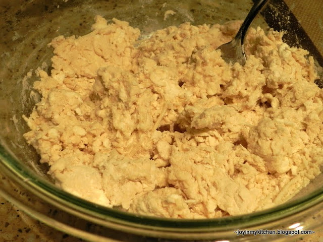
Using your hands, gently knead the dough until it mostly sticks together.
Divide the dough in half.
Lightly flour a flat surface and turn the dough out onto that surface. Roll each half of dough into a medium (about 6-8 inches) circle.

In a medium bowl, mix together 2 C cottage cheese. Stir in herbs (2 tsp. minced garlic, 1 tsp. basil and 1/2 tsp. parsley). Mix well.
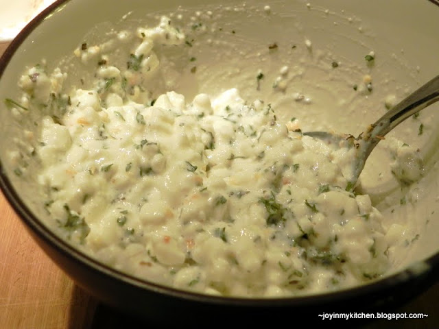
Divide the cottage cheese mixture in half, and spread each half over the one pastry. Spread until you are about 1/2 – 3/4 inches away from the edge of the dough.

Layer each with spinach leaves and halved tomatoes.

Sprinkle with additional herbs if desired.

Carefully lift up and slightly overlay four sides of the circle so that your tartlet is kind of wrapped.

You can take the star approach (above, and back image below), or make more of a square (front image, below). To make the star, you’ll want to wrap up 5 “edges”, 4 for the square.

Place on a cookie sheet. You may wish to line the cookie sheet with parchment, tinfoil or a baking mat.

Lightly spray the pastry with olive oil. We used our Misto to lightly mist the pastry edges.
Bake at 425 for 22-30 minutes until edges are slightly browned.

Note: the moisture from the cottage cheese will spill out while cooking – that’s OK! The longer the tartlets cook, the more water will evaporate. This is why it’s good to have lined your cookie sheet.

Slice & serve.
Serves 4-5 people; 2 slices each. 124 cal/slice, 4.4g fat.
If served as an appetizer & sliced into 8ths, each slice is 78 cals & 2.5g fat.

To reheat leftovers, place in a toaster oven or regular oven and heat until warmed through. Enjoy!
Don't miss a recipe! Sign up for free email updates.No more posts. Check out what's trending.