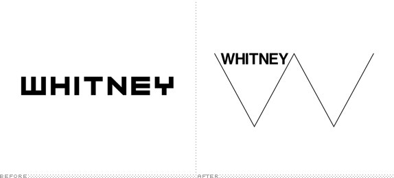
Established in 1930, the Whitney Museum of American Art in New York is devoted to the art of the United States presenting a "full range of twentieth-century and contemporary American art, with a special focus on works by living artists." Its permanent collection contains approximately 19,000 paintings, sculptures, prints, drawings, and photographs, representing more than 2,900 artists and is considered one of the finest in the world. Currently located on Madison Avenue at 75th Street since 1966, the Whitney will move to a Renzo Piano-designed building dozens of blocks south in the Meatpacking District facing the popular High Line in 2015. In preparation for this move, the museum has introduced a new identity designed by Amsterdam-based Experimental Jetset.
Two years ago, Museum staff began a thoughtful internal dialogue regarding the Whitney's graphic identity and selected the design studio Experimental Jetset to develop an approach which embraces the spirit of the Museum while serving as a visual ambassador for our new building. The result is a distinctive and inventive graphic system that literally responds to art--a fundamental attribute of the Whitney since its founding in 1930. This dynamic identity, which the designers refer to as the "responsive 'W'", also illustrates the Museum's ever-changing nature. In the upcoming years it will provide an important point of continuity for members, visitors, and the public during the transition to the new space.
— Whitney announcement
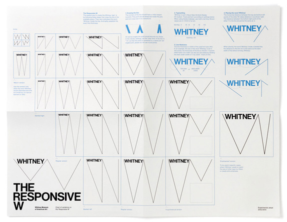
Introduction and animation possibilities for the new logo.
"It would be much easier to present the history of art as a simplistic line — but that's not the Whitney".
This sentence immediately conjured up an image, a shape. It also begged the question: if the history of art should not be seen as a simplistic, straight line — then how should it be seen instead? And secondly, if presenting a straight line is not what the Whitney is about — then what is?
That's when we came up with the idea of the zig-zag line — the zig-zag being a metaphor for a non-simplistic, more complicated (and thus more interesting) history of art. And as it happens, the zig-zag also resembles a capital W.
But even more than the letter W, we think the line also represents a pulse, a beat — the heartbeat of New York, of the USA. It shows the Whitney as an institute that is breathing (in and out), an institute that is open and closed at the same time. An institute that goes back and forth between the past and the future, moving from one opposite to the other (history and present, the 'Old World' and the 'New World', between the industrial and the sublime, etc.), while still moving forward.
— Experimental Jetset case study
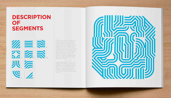
The "periodic table" of the logo's flexibility.
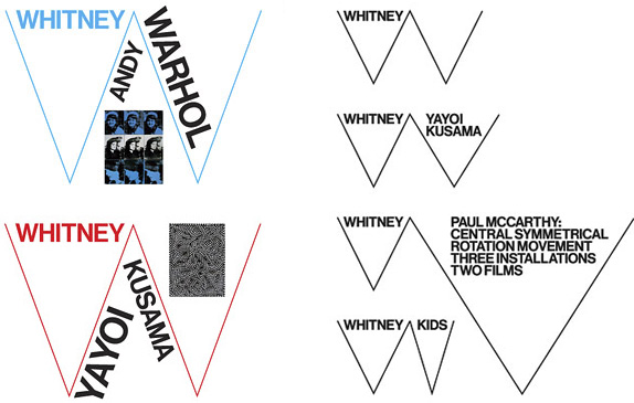
A couple of different ways of populating the logo with information.

The logo adapting to the white space surrounding a piece of artwork shown in its original proportions.
As we already pointed out, it might be exactly this dialogue with the European 'other' that enables the Whitney to continuously define and re-define its American identity. We believe that, within the redrawn version of Neue Haas Grotesk, one can find a somewhat similar tension between the 'Old' and the 'New World': an European typeface, reinterpreted by a young American designer, originally commissioned by an English client.
Added to that, we think that the redrawn Neue Haas Grotesk is a very 'New York' typeface, and we're not only saying that because the designer is living and working in the city. In our view, NHG has a sharpness that is typical for NYC. On the one hand, it is quite similar to Akzidenz Grotesk, and other iconic sans serif typefaces, as employed by typical public institutes such as the NY Subway; on the other hand, we believe NHG possesses the minimalist boldness that one associates with No Wave, Conceptual Art, New York Punk, the downtown loft scene of the '70s, and other subcultural phenomena. In that sense, and as paradoxical as it may sound, we believe that NHG refers to both 'poles' of New York: the established institutional sphere, and the underground tradition.
— Experimental Jetset case study
All product shots below by Jens Mortensen, cropped to show materials bigger.
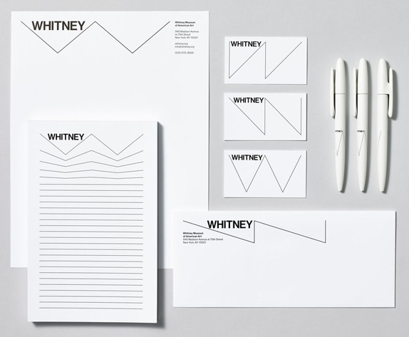
Stationery.
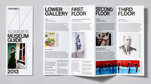
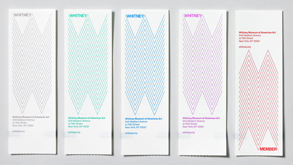
Visitor's guide.
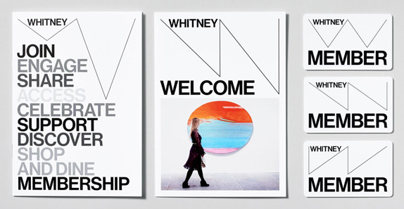
Materials for the Membership department.
Admission tickets.
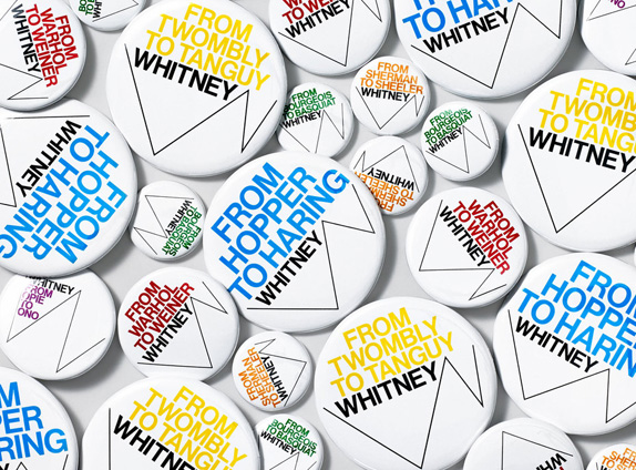
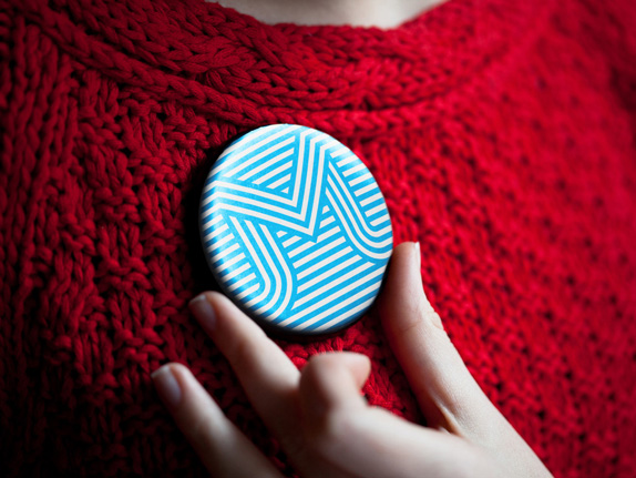
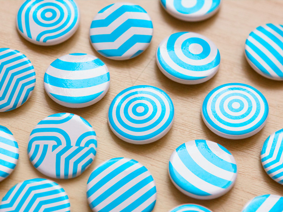
Pins.
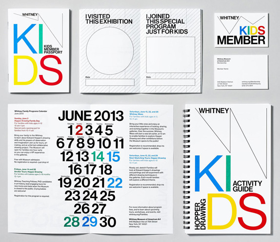
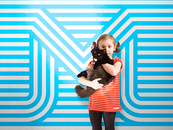
Kids' materials for the Education department.
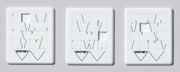
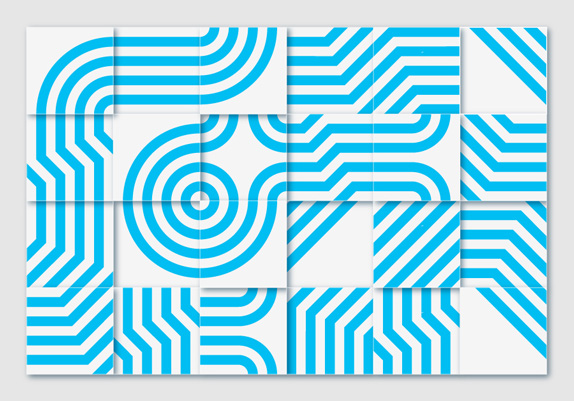
Puzzle for the retail store.
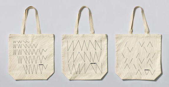
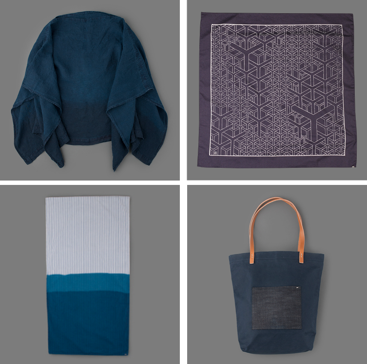
Totebags.
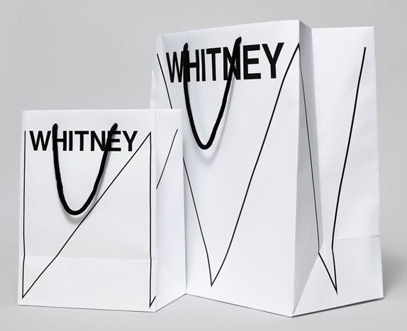
Shopping bags. This is what did it for me. They kick ass.
I purposely put my review at the end of this long scrolling of work because this is an identity that definitely needs to be absorbed in full and as a system, because its individual parts may not seem as strong or that very interesting on their own, starting with the logo. At first glance, and specially in comparison to the previous bold wordmark designed by Pentagram's Abbott Miller, the new logo feels fickle, almost imperceptible and invisible, and, in a standalone application, kind of boring. But as the "W" becomes alive, adapting to its context and changing without much consideration for the proper drawing of a "W", it becomes highly engaging, dynamic, and anything but boring. I actually think this is one of the best logos — even outside of its application — we've seen all year: it goes against conventions, it is perfect for the client and its audience, and it serves as a solid system for the Whitney's design staff to build on their own. I may also be reacting positively to it because it reminds me a lot of our identity for this year's Brand New Conference — if I were a douchebag I would claim they stole my idea. (Kidding of course, at ease).
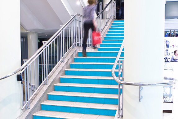
In application, the logo adapts wonderfully to anything and everything, creating a sophisticated, edgy look that fits the museum perfectly. I obviously wish the identity used something other than the rich man's Helvetica — Christian Schwartz's Neue Haas Grotesk (which we also used on the BNConf identity, except it was done ironically) — as it makes the identity feel like something we've seen a hundred times before, especially coming from the Helvetica-loving folks at Experimental Jetset.
Nonetheless, definitely one of the best museum identities in some time — specially within, or perhaps despite, the trend of black-on-white, minimalist museum identities.
Thanks to Scott Lerman for first tip.
 Don't forget to cast your vote about this post online